You don’t have to create a logo on your website! On WordPress, for instance, you can use built-in fonts to create a sharp title and tagline combination. Oh, you’ve been doing it that way, already? It’s not Arial / Arial / Arial, is it? I hope not!
But you probably know you can can waste WAY too much time creating font combinations for websites.
If your WordPress theme, for instance, gives you dozens of Google fonts and embedded fonts to choose from, do you try all of them? Or just stick with the default?
Font Combination Tool
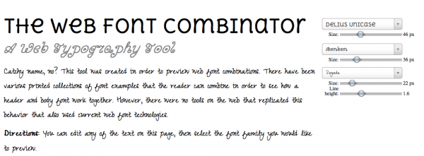
I found a sweet tool the other day to test out combinations of fonts: the aptly named The Web Font Combinator by Chip Cullen.
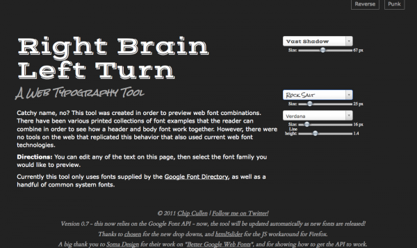
You can change the title line, tagline and paragraph text to your own words or just leave the default. Then start trying out different fonts in combination with each other. Handily, you can adjust the font sizes and the line height of the body text. You can also reverse from black-on-white to white-on-black. Or check out the punk version in yellow and pink.
According to the site “Currently this tool only uses fonts supplied by the Google Font Directory, as well as a handful of common system fonts.” I found that the theme I was using didn’t support all those fonts, so I checked back and forth.
Without going into guidelines for typography ( I couldn’t go far, if I wanted to), consider how you will often see a bold font title with a smaller font tagline in a lighter color below. The tagline is more often italicized than the main text. Your body text needs to be really readable unless your posts are super-short. Arial, Garamond, Verdana, Helvetica and other system fonts are safer bets.
The width I was playing with on my 15″ laptop was about 860 pixels. If your site is 960px across (a standard size), this is a good width to judge how well our text will actually appear on the screen. You probably will not want to use two lines as I did in the example above.
Try it out for yourself – did you come up with any surprises? I started liking Rock Salt, myself.
Warning!
It’s much easier to create BAD combinations, so be careful with cutesy fonts or you could get something like this!

cutesy fonts are difficult to combine!


Wow sweet indeed! Thanks for this informative article and this really neat tool you shared with us 🙂