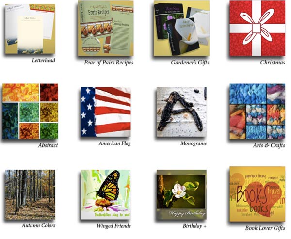
 Someone recently “liked” my Woodswalker store on Zazzle.com and asked how I had added shadows to the category icons.
With so many “flat” designs these days, shadows and dimensional adds aren’t seen as much. I recently checked to see how Zazzle was adding shadows to product images and saw many product images with no shadows at all!
Shadows are one way to make your category images stand out. This can be part of your brand marketing and it can be a good way to separate your category icons from actual products – sometimes it’s hard to tell which is which!
All category icons have to be created elsewhere and uploaded as images to Zazzle, so you have a lot of creative freedom!
To have shadowed category icons, simply add the shadow in Photoshop (or whatever software you use). The trick is that you will sacrifice a bit of your available icon space in order to create a shadow.


Category Icon Size
Zazzle has changed the size of the icons a time or two (we won’t count back any farther than that!). Really, any square size will work – try 250 pixels square if you want actual size and will be including your own category name. Try 250 x 225px if you want Zazzle to add the category title (only available if you have three icons across and choose the title option).
I used shadow settings as shown here:
![]()
You can leave about 10px around the sides and bottom for shadow, depending how big you make the shadow. The key is consistency: make all your shadows the same size, angle, opacity and crispness. The best way is to make a category icon template you can use over and over again. If you have a lot of stores and/or a lot of categories, the consistency can get away from you if you re-design your store or Zazzle re-designs for us.
You can tell that has happened to me!
You can use JPG/JPEG files with a white background or PNG files with a transparent background. A blending option of normal would be better in general for shadows, but the default multiply option is okay for these icons.
Sampling of Zazzle Category Icons
Below are some variations of category icons you can check out for ideas on creating your own. Your available space is square, but you can fill that space in creative ways.
Simple Category Icons
Simple titles can work if you don’t have too many.
Category Icons Using Zazzle Titling
Some storekeepers plan space for the Zazzle titling and others let it fall where it may. When you consider the variety of devices used by shoppers and how the titling adjusts for the device, this is not unreasonable. Don’t think that how YOU see your store is how it is seen by everyone!
Category Icons With Own Titling
Some stores incorporate actual Zazzle product images into their icons, as Liberty Maniacs has done. FamilyTreed* did so to a lesser extent, but has some products pop out of the frame. BluntCard chose a random product to represent categories of product type rather than design. I think it makes shopping easier when it is easy to distinguish categories from products as Jennifer Stuart has done. A title bar is popular and you can mix and match sample products with designs as done on the Beachwalker* store.
Have you seen some category icon designs that really tickled your fancy? Please share in the comments below – I love to get new ideas, too!
Zazzle Category Cautions
I would caution anyone not to spend too much time on category options for three reasons.
One, there’s no telling when Zazzle will make a change that renders them all obsolete (burned once, twice shy)
Secondly, they may not display so well on every device, so you might not get the effect you want.
Thirdly, Zazzle is steering customers AWAY from storefronts in a very determined way, so your category designs may never be seen. If you send customers directly to your storefront yourself, that’s different.
Best of luck with your designing!
*My own stores

Comments are closed.