topNav

Making a photograph tell a story

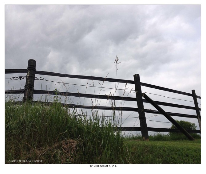
original fence photo
When you’re out and about and see a photo story in the clouds, what do you do? Make a photograph!

What’s the best camera to use?

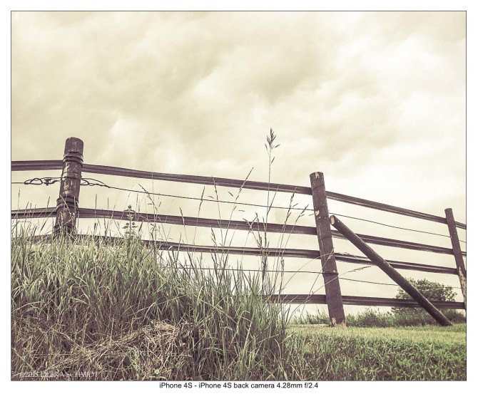
You know  – the one you have with you, of course! I was out walking one day and liked the bank of clouds rising above the posts of the old fence bordering a paddock. I took a quick shot with my old iPhone 4S (hey, it still works fine!) and went on with my walk. No, I didn’t lay down on the ground. I just crouched down because the fence is on a bit of a rise and I wanted some foreground weeds. Fortunately, I was not bitten or stung by anything in the process! Since this was a phone camera, I ended up with a shallow depth of field and a quick exposure: 1/1250 sec at F2.4.

It didn’t look too interesting when I opened it up at home, but somehow it kept saying “play with me, play with me!” I thought this simple image could tell a story if I wrangled it enough.

First, I took the photograph into Lightroom CC and lightened it up and knocked the colors down to give it a more rustic look without going vintage. Trying to make a fence with wavering vinyl rails look vintage just doesn’t work!

country 2

I liked that image better because of the straw color of the sky and some of the grasses, but really it still wasn’t saying anything. How could I get it to talk and tell you of slow country days and splintery fences and dry grasses?

Another round of software? Yes, this time I opened the adjusted image in On1’s Perfect Effects 9.5. Perfect Effects let me easily add layers of textures to the image to roughen it up and slow it down. I varied the opacities of half a dozen textures and added a bit of vignette to darken the edges. Finally my image had some character! I did sacrifice most of the clouds, but that turned out ok.

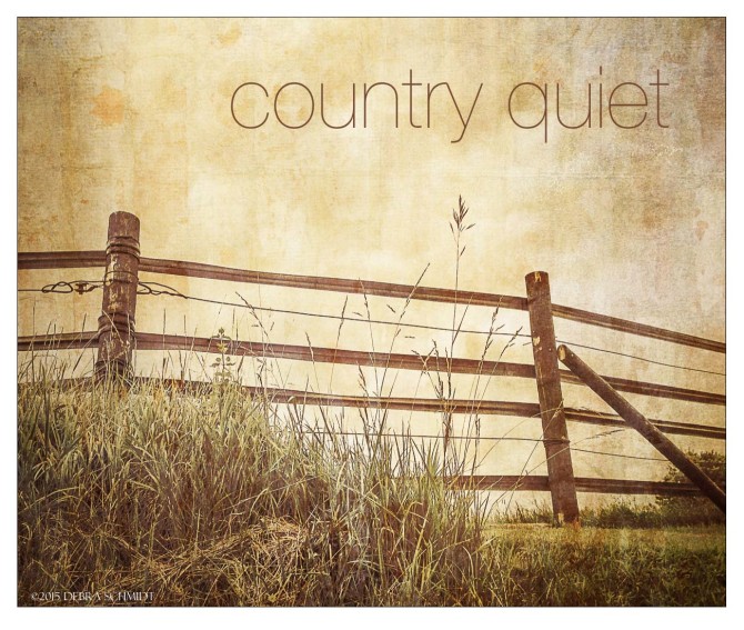
This image slows me down and makes me reach for some weeds to chew on. OK, not really!  but now it has atmosphere instead of just darkish clouds. When I took it back into Lightroom, I realized I should have fixed the fence distortion, so I did nudge the posts a bit with the manual lens correction. Finally, I just set the image in a plain frame (not visible against the white page background) and added some text. Perfect Effects has some nice border effects but I don’t like to apply them until I have decided on the final size of my image.

Now it feels like a scene of quiet, waiting for a horse or a sheep or a tractor to come by. Or maybe nothing at all. And that’s my photo story – you, the viewer, can imagine your own ending.

country 3

Click on the link below or the one in the sidebar to check out On1 for yourself. You can get a free trial. Perfect Effects is only one part of the suite of products. Note: I’ve been using On1 software for about 7 years and am looking forward to the new version coming out this month. Links shown are affiliate links which means I may make a commission on any purchases. Which would be awesome and appreciated!

728x90

New, Re-sourced, Out-of-Stock and Discontinued Items on Zazzle

updated 6/17/15
Zazzle.com went into a new product frenzy over the past year or so and there have been hundreds of new items added with no end in site. I couldn’t find the exact number, but I believe it was mentioned by Monica in one of the Zazzle chats. Sorry, I didn’t want to go counting them up myself!

Some of the new products prove popular, some are duds and some don’t last long.

ArtInspired and Maz put together a handy list of new products and links to them in the Create Products forum.

For those who don’t know, new products (or lack of) are announced every Friday morning in the Zazzle News forum. What you see on the blog or in an email a few weeks later is when there are designs on the new products and some of the initial bugs are worked out.

Zazzle has confirmed today some products that have been discontinued, so take them out of your templates if you have them there and don’t waste your time on them. Zazzle will be hiding them, but you may want to do so yourself ahead of their actions. You may also want to remove them from your Pinterest boards. I guess everyone has to decide that for themselves.

Discontinued items as of June 2015

In the order that they came to mind, here are some of the discontinued items. It is impossible for designers/sellers to know whether an item is just continually out of stock, being re-sourced to a new supplier or completely dropped for the time being unless Zazzle confirms it. You have to get this info from the forums and you have to go looking for it. This is what I’ve found that are confirmed discontinues.

  • Keds shoes – you know this, just quit holding your breath they are coming back. They’re not – although the one-time presence of them still screws up your categories because you can’t delete a category with a hidden product. For those of you who weren’t around, Zazzle hid the shoes because they had once thought to get a new supplier and migrate the shoe designs over. Crazy, if you ask me, because of the complexity of the designs, but that’s what happened.
  • Slippers – these came out around Christmas 2014, were popular and then disappeared. Confirmed discontinued 6/16/2015.
  • Scarves – these came out in late 2013 and were popular even though the design area consisted of two small blocks. After constant color shortages, they eventually just went out of stock altogether. Confirmed discontinued 6/16/2015.
  • Leggings – Were these popular? I have no idea. They were odd to me because, like the scarves, they had two rectangular design areas. If you want all-over prints for leggings, try RedBubble or Society6. Confirmed discontinued 6/16/2015.
  • Maternity t-shirts – no idea what happened with these! Obviously, a limited market, but very targetable. Maybe CafePress still has theirs. I know CP just eliminated dozens of products, but I’d guess not these. Confirmed discontinued 6/16/2015.
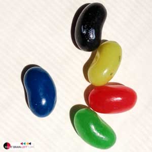
  • Candy jarsjelly beans-2these came out about three years ago and were the first of the breakable kitchenware that we got. Calling them candy jars was always a stretch because they were the size of a pop can. In the USA, every candy jar I’ve ever seen was more of a gallon size. And clear, so you could see whether you actually were interested in any of the selection inside. So, we’re left with the glass Jelly Belly™ jars. Which are half the size of a pop can (soda can or Coke can for non-Midwesterns) and hold a handful of tiny jelly beans.
  • Christmas hats – these were introduced for Christmas 2014. One of your novelty items, for sure. Discontinued early 2015.
  • Christmas stockings – there were two different stockings introduced last Christmas. The plain stocking with the red back is still available. The one with the cute curled up toe is history. Discontinued early 2015.
  • Flip flops – for one glorious summer in 2013, we had these beautiful, pricey Sandalei flip flops. People loved them if they could fork out the forty bucks or so they cost. The company seemed to have had issues and weren’t able to continue production. Zazzle had mentioned looking for a new supplier, but it’s already mid-June in the northern hemisphere, so don’t hold your breath on this one either. Pretty sure CP has an inexpensive flipflop available to design.

In fact, think twice about designing ANYTHING that is worn on your feet or legs. Footwear doesn’t have a good track record. There are some other companies where you can get custom tennis shoes and flip flops, so check around at CafePress, BucketFeet and other places.

  • Embroidered Ladies shirts – I’ve not done much with embroidered clothing, but it was mentioned in the forums that ladies embroidered t-shirts and polo shirts seem to have been discontinued. Since I don’t even see them in the embroidery section, I’d say that’s a safe bet.
  • Speck cases – these have been gone awhile and removed from stores at last. I bring them up for two reasons:
    • 1. Zazzle had a huge discount sale on these when they discontinued them and sold them for a dollar or two (if memory serves). That’s the only sale like that I’ve seen, but it could happen again.
    • 2. I do think they may still be messing up categories by acting as hidden items you can’t remove (like the Keds shoes). All you can do is recycle the category with a new name and put something else in it.

Out of stock for suspiciously long times:

Some items have just had the dread orange pop-up for a long time with no official word what’s happening. Often, there is a lengthy out-of-stock – remember how long envelopes were gone, but came back? Obviously, I don’t know what Zazzle is doing behind the scenes, but I’m guessing these items are:  discontinued but not removed, in the process of attempted re-sourcing or experiencing supplier issues.

Rickshaw folio planners – these seem to be available, but have been sold out  for quite awhile. I asked in the forums a month or so back and didn’t get a response. They don’t show up when you search by the brand, Rickshaw, so I think they’re history.

Edible Frosting Rounds – these seem to be available, but out of stock for awhile according to the forums and as of 6/16/15. edit: 6/17/15 Cbendel wrote in the forums that she contacted the company; they’re not making these anymore.

Cork Coasters – these still seem available, but have been out of stock for a while as of  6/16/15 The other cork products are still available, so status unknown on this one, I’d say. edit: 6/17/15 Wollastonite pointed out in the forums that these were officially discontinued in June 2014.

Skins – a handful of skins (decals) have been out of stock as of May 1st. This whole line up of more than 200 products seems to have been abandoned, to speak frankly. The newest iPhone skin available, for instance is for the iPhone 4. I have sold some skins for laptops, but the rest aren’t worth bothering and it’s hard to trust that they will stick around since there haven’t been any updates.

Speckled Paper – for letterhead and stationery, the speckled version has been out of stock for as long as I can remember.

Style and/or Sourcing changes

There have been other style or sourcing changes that led to product changes. From a design standpoint, these changes don’t mean much once they’ve happened. You have the option to set automatic design migrations in your account settings if you’re comfortable with that.

From a promotional standpoint, you may need to update a blog post or Pinterest pin if you have discussed a particular brand, style, material or color OR if you want to share IRL (in real life!) images.

Some that I recall are:

Poker chips – the initial style was replaced earlier this year by the maker and now they’re all clay.

Wrapping paper – this got re-sized in 2014 and any old designs that weren’t repeating patterns probably looked terrible on the new wrapping paper. Mine did, anyway! I think Zazzle migrated the designs and then hid these until we could check for ourselves.

Invitations – The sources for these were all changed in late 2013. The edge effect adds were at different times. I did design and re-buy an entire set of invites so I could see the papers and how the printing turned out on them, but I never made a new post to describe them all. It’s on my list. . .  (You can purchase these yourself if you like. It is helpful to compare the papers!) Zazzle invitations
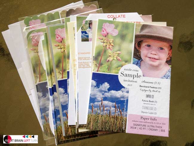
Liberty water bottles – these went out of stock a while ago, which was too bad. They were nice bottles. (I have one and wrote a post about it. I’m not yet familiar with the newer ones.) If you promoted water bottles by brand anywhere, you’ll need to update that. These were replaced by a bigger selection of SIGG brand water bottles and thermoses and an unbranded water bottle. Zazzle did a fantastic job of migrating old designs to new bottles for these, but you needed to take a look anyway.

T-shirts – there was a big shift in tees about two years ago with a lot of new colors added. I think the brands were shuffled around as well, but someone who does more shirts would know better than I do. Didn’t the organic ones have a big change? The models for shirts underwent a big change, too, and it sounds like there may be more changes coming from the wording of the announcement of the new ladies’ tank tops last week. Don’t be surprised when a fashion line like t-shirts is continually being changed.

Tote bags – this was not a very big event about five years ago or more. The only reason I recall it is because I bought a big tote bag just before they changed over and then couldn’t use to to show a product IRL. I have enough free tote bags that I just haven’t bought any more since then. Tote bags styles/colors DO go in and out of stock often enough, however.

Mugs – this was a non-event several years ago, but we got different colors and more sizes.

Kitchen Towels, cloth placemats and cloth napkins – these were re-sourced in early 2013. The reason I mention them is because there was a lot of fanfare with the initial supplier being an employer of single moms and how it was a socially good thing. I don’t think they could keep up with the demand, but I also think the towels were not initially waffle weave. So, if you bought the early ones, they aren’t the same anymore. When I buy tea towels, which I prefer for the flatness of the fabric, I’d be more likely to buy fat quarters of fabric instead and just hem them up.

 Wrap-up

Did I miss any? Let me know in the comments and I’ll add them. It can be frustrating to know you may be designing for nothing and hopefully this helps avoid more of that for all of us!
 

Spring Cleaning my Zazzle Work Life

DumpsterWhere have I been? Just trying to get my life in order – particularly my online work, including my Zazzle stores and files!
My Zazzle image folder was overflowing with nearly 10,000 images in it. I didn’t even know what I had uploaded anymore. I couldn’t stand being a hoarder anymore, so today I began images. A thousand were easily zapped and I’ve just begun. Starting this process this morning as a spring breeze blows in the open window got me thinking that I should refresh this website as well; Right Brain Left Turn deals a lot with Zazzle. This site has been on my mind and today’s the day to begin!

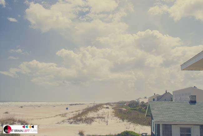
View from the Florida house main floor.

View from the Florida house main floor.

I started on Zazzle over seven years ago, sitting at a big table in the second story kitchen of a beautiful beach house on St. Augustine Beach in Florida. I was looking for something new to do after an unsettled few years and the wrenching difficulty of getting caught in the real estate bad times that had hit Michigan and me really hard. From that table, I could look out the huge windows and over the sand dune to the beach and the Atlantic Ocean stretching out forever. Zazzle was part of my reinvention to become a more creative, less location-restricted person.

Going through my image files, I see my progress over seven years – my images today are better done, my Photoshop experiments more restrained, my text designs more sophisticated. I see national and world events  – earthquakes, blizzards, a tsunami, political elections and more – reflected in my designs. I see the places I’ve been living echoing through in the images: Florida, Colorado, New Mexico, Georgia, Texas, Michigan. I can see the seasons and the life changes as my designs continued to reflect events in my own extended family: proms, graduations, weddings and beautiful new babies and fascinating toddlers.

I could see the interests that are stubbornly in my DNA: beaches, woods, stones and wildflowers; family and travel. I can see the interests that I just couldn’t sustain: weddings, politics and current events.

Boiler furnace

There was a little problem with the heating system.

I haven’t blogged hardly at all since last summer. I moved to a house out in the country that turned out to need a LOT of work. In fact, it wasn’t even livable (although someone had been living here until the week before I moved in!). So, I visited my mom up north where there was no internet. When I came back six weeks later, it took a month to get internet here. Waiting for that, we started working on the house and workers were here all the time for about three months.

I had to move my office setup a few times as the construction progressed and each time, I lost a bit of forward momentum. The internet was another thing. When first installed around Christmas (I did miss most of the Christmas season unfortunately!), it zipped along for about six weeks at 5.9Mps and then dropped to near nothing with hundreds of drops a day. You absolutely cannot use Quick Create nor upload files under those conditions.

The internet provider – the sole choice in this town of 1033 – had installed a new line on the other side of the state and, somehow, screwed up rural customers all over the place. I know all the local techs by name now: Joe, Ron, Jason, Jake and Russ. Terrible internet, but the nicest customer service you’d ever want! On the phone AND in person. It took them until the end of May to get it mostly fixed.

Internet speed

Today’s internet speed. Hey, at least it works!

So, my internet is not great, but it’s quite a bit more reliable. (Never mind that it was out all Sunday evening due to unscheduled line repairs.) Now, I feel like I can concentrate again on my online work. Hurrah!

But, first, getting the junk out of the way. Hundreds or thousands more images are going to go. The Zazzle image storage system is just too awkward to keep thousands of files. I kept hoping it would be updated, but the awkward search function is all we’ve gotten in ages.

So, I’m cleaning house with my Zazzle images, my own image files on Lightroom (63,250 keyworded photos!) and my blogs.

Look for more postings, useful info and tutes on RightBrainLeftTurn.com over the coming weeks and months.

I’m back!

paddock

Spring afternoon in the country


Add a shadow to category icons on Zazzle

Woodswalker category iconsSomeone recently “liked” my Woodswalker store on Zazzle.com and asked how I had added shadows to the category icons.

With so many “flat” designs these days, shadows and dimensional adds aren’t seen as much. I recently checked to see how Zazzle was adding shadows to product images and saw many product images with no shadows at all!

Shadows are one way to make your category images stand out. This can be part of your brand marketing and it can be a good way to separate your category icons from actual products – sometimes it’s hard to tell which is which!

All category icons have to be created elsewhere and uploaded as images to Zazzle, so you have a lot of creative freedom!

I am assuming you already know how to use the category icon option.

To have shadowed category icons, simply add the shadow in Photoshop (or whatever software you use). The trick is that you will sacrifice a bit of your available icon space in order to create a shadow.

category icon example

sample category icon


Category Icon Size

Zazzle has changed the size of the icons a time or two (we won’t count back any farther than that!). Really, any square size will work – try 250 pixels square if you want actual size and will be including your own category name. Try 250 x 225px if you want Zazzle to add the category title (only available if you have three icons across and choose the title option).

I used shadow settings as shown here:

Shadow settings for Zazzle category icon

You can leave about 10px around the sides and bottom for shadow, depending how big you make the shadow. The key is consistency: make all your shadows the same size, angle, opacity and crispness. The best way is to make a category icon template you can use over and over again. If you have a lot of stores and/or a lot of categories, the consistency can get away from you if you re-design your store or Zazzle re-designs for us.

You can tell that has happened to me!

You can use JPG/JPEG files with a white background or PNG files with a transparent background. A blending option of normal would be better in general for shadows, but the default multiply option is okay for these icons.

Sampling of Zazzle Category Icons

Below are some variations of category icons you can check out for ideas on creating your own. Your available space is square, but you can fill that space in creative ways.

Simple Category Icons

Simple titles can work if you don’t have too many.

Category Icons Using Zazzle Titling

Some storekeepers plan space for the Zazzle titling and others let it fall where it may. When you consider the variety of devices used by shoppers and how the titling adjusts for the device, this is not unreasonable. Don’t think that how YOU see your store is how it is seen by everyone!

Category Icons With Own Titling

Some stores incorporate actual Zazzle product images into their icons, as Liberty Maniacs has done. FamilyTreed* did so to a lesser extent, but has some products pop out of the frame. BluntCard chose a random product to represent categories of product type rather than design. I think it makes shopping easier when it is easy to distinguish categories from products as Jennifer Stuart has done. A title bar is popular and you can mix and match sample products with designs as done on the Beachwalker* store.

Have you seen some category icon designs that really tickled your fancy? Please share in the comments below – I love to get new ideas, too!

Zazzle Category Cautions

I would caution anyone not to spend too much time on category options for three reasons.

One, there’s no telling when Zazzle will make a change that renders them all obsolete (burned once, twice shy)

Secondly, they may not display so well on every device, so you might not get the effect you want.

Thirdly, Zazzle is steering customers AWAY from storefronts in a very determined way, so your category designs may never be seen. If you send customers directly to your storefront yourself, that’s different.

Best of luck with your designing!

*My own stores

How well does a watermark protect your art?

squirrel running off with a hickory nut

Some people think anything on the internet is available for their use. If it’s posted somewhere, it must be mine to use. No. No. No. (The squirrel has a whole different claim to a hickory nut crop!)

I remember the first watermarks I encountered. They were on elegant stationery that revealed a subtle crest or other pattern in the paper. I thought that was an indicator of fine paper.

Paper money and postage stamps were watermarked as well, but never caught my attention the same way.

Watermarking has been around since 13th century Italy when paper makers first used it to identify their products. They twisted wires twisted into shapes such as crosses or fruit or animals and then sewed those wires into their paper molds. When the paper was pressed into the molds, the wires would add their shape to the wet paper and therefore mark it so customers would know who had made the paper.

The processes have changed in this digital time, but the purposes remain. Photographers and designers who display their work online often add copyright information and/or watermarks to their work. Watermarking serves to identify the creator (or owner) of an design and to make counterfeiting difficult. Or sometimes, watermarking is used to convey information.

sample image example

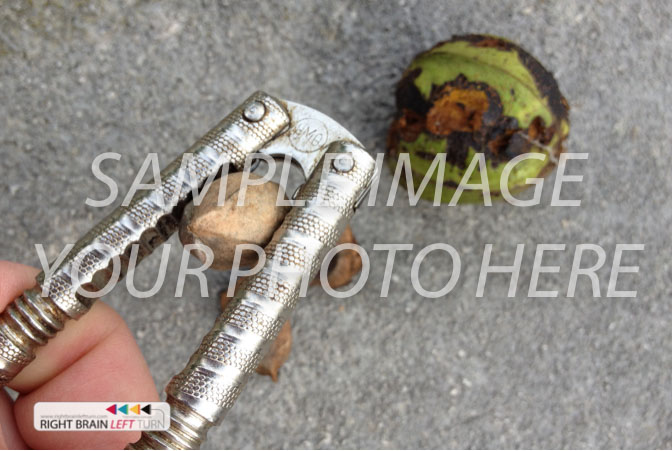
Sample Image watermark is used for templates and meant to indicate a photo should be replaced with your own. People could steal these or forget to exchange one for their own photograph.

The old watermarks would have been impossible to remove because the physical products could not have been altered that way. Some of them were undoubtedly copied and presented as originals. We see this with fake designer products today or, of course, with counterfeit money.

This is why the grocery store clerk will hold your twenty up to the light or swipe a marker across it to verify its authenticity. Marks integrated into the bill’s composition indicate its authenticity.

In the digital world of photography, the counterfeiting  – copying – stealing – appropriating – borrowing – etc – works differently. No one tries to make an exact copy of your work. (Well, they might by setting up the same shot if they could, but that would technically be theirs.)

No, thieves with innocent or malicious intent or even entitlement mentality may take your work and try to erase your ownership of it. They may then present it as their own or make it just look like freely available work.

If you think a watermark with a copyright symbol does much to protect your work, think again. I tried to explain this to someone in a forum recently. She didn’t get it and thought anyone who knew who to remove a watermark must be a thief. Sigh.

Copyright information does inform a viewer that the image has an owner. People know less – or care less – about ownership than we would like. How many times have you heard a friend say, “Oh, I didn’t want to pay for it, so I just made copy. It doesn’t hurt anyone.” (Remember Napster from a few years ago?)

As visual designers who show our work online, we have to know what we are up against.

corner copyright

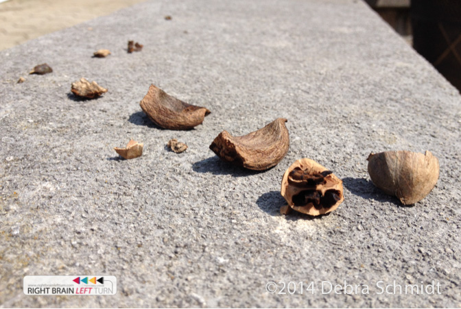
Yes, I know this one has two corner copyrights. The one on the bottom right is a simple copyright you may put anywhere. The one of the left is for identification if this image were shared and to keep them all consistent.


The easiest way to remove a visible watermark is to crop it out when it’s in a corner, right? The second easiest is to purchase some software and make the watermark go away.

copyright symbol

Some photographers and stock photo companies like to add corner to corner lines and a copyright symbol or logo in the middle.


Yesterday when a “photo restoration” software was brought to my attention in another creative forum, I made a quick video to show how quickly, easily, and well an object can be removed from a photograph.

We, as photographers, clearly need to be aware of how easily this can be done and employ as many different tactics as possible to protect our work. This particular software is on a site registered to someone in the Russian Federation, a fact I found not very surprising. The truth is, we hear of a lot of hacking and image theft originating in China and Russia. Check eBay or Amazon or other big online markets to verify that for yourself.

Since watermarking is frowned upon by Google searches and now by Zazzle, we can rely on watermarks even less to protect our work because we can’t even use them.

How do we protect our work from theft? Or do we go after thieves after the act has already been committed?


Want to know more about watermarks? Check out the Wizard of Watermarks or The Memory of Paper.


If it weren’t very obvious anyway, I should let you know I am not a lawyer and I’m not playing one either.


Somehow I took the summer off!

dock-1
Sometimes, the time just gets away from you! Now that September is well underway, I’ve come back to working on RightBrainLeftTurn.com again. Of course, I was working on my Zazzle stores and another project I’ll tell you about later, but the best part was playing with a box! (I really did not spend my time sitting on a dock, lovely as that idea is!)dock

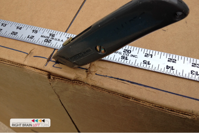
doorsI spent a lot of the summer building a pirate ship for two little girls. It turned into a giant coloring book with artistic spurts broken up by screaming and laughing through the portholes. I found little girls are only interested in swords for about 30 seconds, hats for about two minutes and eye patches for about five minutes.
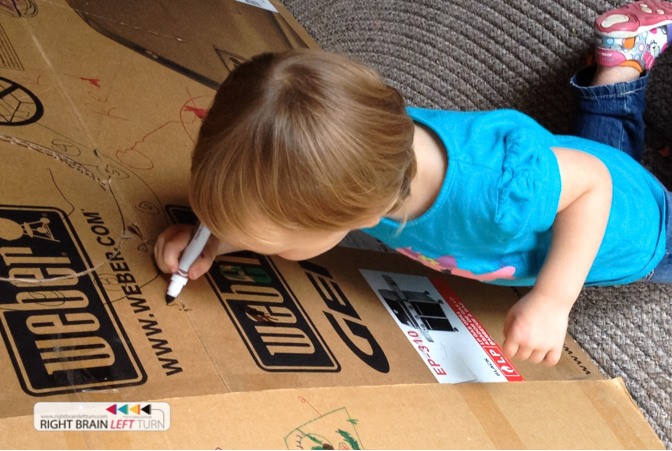
But cardboard and crayons and markers are good for hours and hours.

pirate ship


decorating

If you have the chance to play pirate with a beautiful two year old, turn off your computer and go play! The computer will always be there, but the children will grow up and move on.

two


Zazzle Storebuilder Premium Plugin

The Zstore Helper Plugin – Premium Edition is no longer available for sale. If you already have a copy, it should still be working, but there won’t be any updates.

Bill H (aka FishTsdotcom) had developed a premium version of Paul Robinson’s free Zstore Helper plugin and offered it for sale on his site. Bill and Paul had worked out the arrangement between them about the plugin.

I learned a few days ago that Bill passed away this past February and all of his web properties have since been taken down. I don’t know the legal status of that particular WordPress Zazzle plugin.

RIP, Bill. Your Zazzle colleagues have missed you and will remember you as a helpful and friendly contributor to our community.


Happy Thanksgiving, everyone!

turkey

One summer, I was the one feeding the turkeys every day and making sure the silly things were locked up at night. Truthfully, I was a little intimidated to have two turkeys run straight at me because they heard the rattle of corn in their feed bucket. Not everyone is anxious to have animals eating out of their hand when they first meet! If you’re not careful and fast with their food, turkeys will nip you!

Something you may not know about turkeys if you have never seen one out in the grass under the sunshine – their feathers are absolutely gorgeous! They are iridescent with rainbow colors, not plain dark brown at all.

woman with quill

Madeline Breckinridge, full-length portrait, seated at desk, facing slightly left, with quill pen in hand. George Grantham Bain Collection at the Library of Congress

Can you imagine if you were writing or drawing with a turkey feather quill and ink? Your feather pen may have been beautiful and not ordinary at all!

On this day of Thanksgiving in the United States, I’d like express my gratitude for a world of beauty and color.

Not just blue skies and rainbows, but turkey feathers, too.

Wishing you all a happy Thanksgiving with many delicious and colorful blessings!


Do you focus like a racehorse?

It's hard to keep your head above the flood

It’s hard to keep your head above the flood

Too many days go like this. . .

I’m working on a new snowman design and adapting it for a variety of Zazzle products. Crap, there’s another new product it would work well on. Then an email pops up that looks interesting (see below). Or, I have to wait for Photoshop to process something complicated.

My plugin crashes. My iPhone is insisting on another update. Waiting for that, I then check on a recent Zazzle sale and consider posting it to Facebook or Pinterest. If it’s Firefox, I switch browsers so I can use a handy referral tool. On the way, I have to update something else! The phone rings and I really do need to talk to my mom – she’s been “forgetting” to take her medications lately.

Where was I? Focus for creatives is hard.

Oh, I should go back to that email. I need to write a proposal for that talk about WordPress. What happened to that snowman design? Well, I might tweak a new address photo card design, or an old Christmas ornament that used to sell well. I go to look for it and am dismayed again at my old category folders on this store or that. I should make new ones. And it would be fun to design new banners and product pins.  Then someone wants to borrow the keys or ask what I think about this idea or that. I go to look for the other snowman design and run across a bunch of images I had forgotten about that would be perfect for the new watches. Oh, I need to add templates to my QC folder. Oh, wait! I just sold another wedding ornament – maybe I should make a couple more of those real quickly?

But the sun is shining and I really do need some fresh air and exercise. And someone has to run to the grocery store today. And another email just popped up with a big sale on greeting cards that reminds me I should design some awesome cards for myself this year. Oh, and I have a coupon for free business cards that I want to make, too.

And so on. It’s mentally exhausting just typing this. And every day has the potential to scatter my energy just this way!

I am not off to the races this way! The article below by Jack White is a reminder of a critical component of why and how races are won, not just run. It occurs to me that we can set up our workspace for focus and cut out a lot of distractions, but. . .

A racehorse can focus because he must and because he can. He has only to step into the flow of the race and go.

A wild horse just running around would have to be aware of his surroundings – what threats are flying in the sky above him? how many rabbit or prairie dog holes lie ahead? where is the next meal coming from? does he have a mate to run with and a colt to teach? is the weather threatening?

He can only focus on running if he watches where he is going and keeps an eye on his environment. A horse with blinders in the wild could easily be a dead horse.

A horse in a race has someone else taking care of so many details – the food, the shelter, the ground to run on. And the jockey on his back to guide his moves and urge him on. He has only to do what he guided to do and to run his heart out. For a short time.

How can we creatives – designers, writers, promoters – have racehorse times in our days?

I sure can see the benefits!

I cleared off and cleaned my desk last night. I re-arranged the ergonomics of my computer and chair. I am staying home and trying to concentrate at the computer where I am one of my worst enemies. 🙂 I just want to be able to step into the flow. But it’s not just the flow, is it? Not only is focus for creatives who also market and run their own show hard, but so are the daily measurements. The racehorse has a goal and everyone knows when the race is done. How does an artist know? A finished design? One hundred new products? Twelve sales? Eighteen posts? Fourteen hours?

How do you define your goal? This post was not on my mental list of things to do today, but needed to be written. My goal today is to accomplish a laundry list of items; number of hours isn’t the right measurement for me today.

Back to work now.

Wish me a productive day! And I wish you the same.

Keep Your Blinders On

by Jack White

I have found art to be a jealous mistress. She wants your full attention or her jealousy will find a way to destroy your life. […]

Read the rest of this article at:
http://faso.com/fineartviews/68417/keep-your-blinders-on

———————————————-
This excerpt appears courtesy of FineArtViews Art Marketing Newsletter by FASO,
a free email newsletter about art, marketing, inspiration and fine living for artists,
collectors and galleries (and anyone else who loves art).

For a complimentary subscription, visit: http://www.faso.com/art-marketing-newsletter

———————————————–