topNav

Tag Archives | Zazzle tips

What does the Zazzle Volume Bonus change really mean?

*** note: this post is a bit of an info-rant ***

Zazzle.com will send out September checks and PayPal deposits in two weeks for July sales.

This will be the first month with zero – or almost zero – Volume Bonus in the payments of many Zazzle storekeepers (SK). For me, it will be the first time since February 2009 that I won’t get any Volume Bonus.

It’s going to hurt. Some of us will be hurt more than others, but anyone who had halfway decent sales is kissing significant money good-bye.

That’s how it works when you’re not in charge, isn’t it? We don’t negotiate these deals, we just pray not to be dropped too hard.

Are you at the mercy of those bigger than you?

Are you at the mercy of those bigger than you?

 What Zazzle was up to this summer

If you have been on Zazzle for awhile and paying attention, you know about the constant changes. That is simply how internet-based companies operate. Plus, they make changes in the summer in order to be prepared for the holiday season. Starting late last fall, there was a tremendous surge of downward pricing pressure put on storekeepers with implied promises that everyone would “make it up in volume,” and threats that no affiliates would refer your products if you didn’t lower your royalties below 25%. Then 15%. Then 13.3%. Now 10% with 5% on the horizon.

In June, Zazzle SKs and affiliates got official notification of this summer’s changes. Mega-changes and definitely not to the benefit of storekeepers. At least, not that we can see.

The entire Zazzle architecture was re-done with limited apparent input from UX experts. The storefronts changed – SK customization was wiped out overnight and stores became pasty pale shadows of their former selves. (Thankfully, SK protests were heeded and the colors revised!) The Zazzle look itself got stunningly attractive. (They have got some great product photographers and product displays being shown.)

Across-the-board 5% price increases went into effect. Base royalty prices dropped from 10% to 5%. The 5% high-royalty penalty kicks in at 15% instead of 20.1%. The design tools changed. The font tool, especially, went to hell. That was all fun.

Not.

Re-cap of what happened to the Zazzle Volume Bonus

The biggest impact for many SKs, however, is the change to the Volume Bonus. To give you an idea, many SKs have compared it to “what CafePress did to us” several years ago. [In 2009 CafePress changed their royalty policy and put a lot of people out of business and shocked and angered many more. A lot of those designers fled to Zazzle as a safe haven. I was one of those already on Zazzle who bailed out of CP.]

The generous Volume Bonus (VB) that we all loved has, essentially, been done away with. We Zazzle storekeepers and affiliates used to get VB for sales we referred as well as for our own sales that had not been referred. It could add up to a nice bit of change if you were a solid seller. That is hundreds or thousands of dollars each month could have been earned solely from VB. The more you sold, the higher the percentage of VB as well. It was really nice at the holidays.

Well, that’s gone. Some people are going to sink.

Is your vessel in danger of capsizing?

Is your vessel in danger of capsizing?

What’s left is a new and eviscerated version of VB. Here’s how it is more politically described on the Zazzle blog:

Volume Bonus Becomes Associate Volume Bonus (from the Zazzle blog)

We’re committed to providing strong incentives to all Zazzle community members to encourage each person to put in the extra effort in generating more awareness for products on Zazzle. With that in mind, starting July 1st, the current volume bonus structure will be transitioned to a Zazzle Associate Bonus Program. You can make money by referring customers to Zazzle. We believe that this new program will align the Zazzle community around generating the most revenue from referred traffic [emphasis added]. As a Zazzle Seller you are already enrolled in this new program!

In a nutshell, Zazzle doesn’t need more artists. Creators are a dime a dozen and expendable. What it needs are marketers who promote products.

Here are the details laid out in the new Volume Bonus Program Terms published by Zazzle,

The Bonus will be calculated as a percentage of Base Sales on a domain-by-domain and currency-by-currency basis as follows:

1% of Base Sales for Base Sales in the applicable month from $100 to $999.99; plus
5% of Base Sales for Base Sales in the applicable month from $1,000 to $4,999.99; plus
12% of Base Sales for Base Sales in the applicable month from $5,000 to $99,999.99; plus
17% of Base Sales for Base Sales in the applicable month $100,000 and above.

Base Sales means the purchase price received from the customer less the Markup Amount; amounts charged for shipping, handling, packaging, insurance, and sales or similar taxes; refunds, credits, and reversals; and the face value of the postage (if the revenue is for Zazzle Custom Stamps). The Markup Amount means the purchase price multiplied by either the Royalty Rate applicable to the product sale or the Standard Royalty Rate in the case of the sale of a private product.

So, if I’m figuring this right, the Volume Bonus has been negatively impacted by three factors:

  1. It only applies to sales for which you get credit for the referral instead of everything that wasn’t referred.
  2. The percentages dropped. A lot.
  3. The percentages are applied on a lower base price now (5% instead of 10%)

If  you want to torture yourself without banging your head on your desk, read the Previous Volume Bonus Program Terms here:

Volume Bonus Program prior to July 1st

To recognize Sellers and Associates who make Zazzle successful, we offer the following volume bonus program.The following terms of this agreement (“Agreement”) apply if you create public products, design(s) or art for sale on the websites owned or operated by or for Zazzle Inc. (“Zazzle”) and/or participate in the Zazzle Associates Program.Every month, Zazzle will pay you a bonus amount (“Bonus”) based upon the following sales:

  1. A sale of a product for which you earned a Royalty, which was not subject to a Referral Carve out (as defined in the Non-exclusive License Agreement); OR
  2. A sale of a product for which you earned a referral fee.

The Bonus will be calculated as percentage of Base Sales on a domain-by-domain and currency-by-currency basis as follows:

  1. 7% of Base Sales for Base Sales in the applicable month from $100 to $999.99; plus
  2. 12% of Base Sales for Base Sales in the applicable month from $1000 to $4999.99; plus
  3. 17% of Base Sales for Base Sales in the applicable month $5,000 and over.

Base Sales means the purchase price received from the customer less the Markup Amount; amounts charged for shipping, handling, packaging, insurance, and sales or similar taxes; refunds, credits, and reversals; and the face value of the postage (if the revenue is for Zazzle Custom Stamps). The Markup Amount means the purchase price multiplied by either the Royalty Rate applicable to the product sale or the Standard Royalty Rate in the case of the sale of a private product.

You want it spelled out in dollars and cents?

OK, here’s a couple of examples of what the change in Zazzle Volume Bonus means for a moderate and a very good seller. Assume all sales were U.S.A. based and evenly split among self-referred, 3rd party referred and not referred. These are all rough samples and do not take all the nuances into account. That said, they are, to the best of my knowledge, what we called “directionally correct” where I used to work.

Example 1. A moderate seller who is covering maybe the car payment and groceries and a few extras with their Zazzle income. She has sold $3000 in BASE sales of Zazzle merchandise.

Under the old plan, she would get a volume bonus based on 2/3 of that $3000.

  • 7% VB on $900 = $63.
  • 12% VB on $1000 = $120
  • Total VB = $183

Under the new plan, she would get a VB based on only 1/3 of that $3000, or $1000 is VB eligible. Actually, with the increased prices and the decreased base price, the math gets way crazy.

  • 1% on $900 = $9
  • Total VB ≤ $9

Her royalty check could vary widely with those sales, based on how she has prices set, but let’s say it was $600. The $183 in VB was a nice add and buys groceries. That’s a 20+% drop in income.

Example 2. A good seller who makes a living from Zazzle. She has sold $30,000 in in BASE sales. That’s maybe $6000 in commission.

Under the old plan, she would get a volume bonus based on 2/3 of that $30,000. That’s $20,000.

  • 7% VB on $900 = $63.
  • 12% VB on $4000 = $480
  • 17% VB on $15,000 = $2550.
  • Total VB = $3093

Under the new plan, she would get a VB based on only 1/3 or $10,000.

  • 1% on $900 = $9
  • 5% on $4000 = $200
  • 12% on $10,000 = $120
  • Total VB ≤ $329 (again, not taking the price changes into account)

Well, to put it bluntly – that sucks.

How are you handling the change in Zazzle Volume Bonus terms?

Based on way-too-extensive forum readings, Zazzle storekeepers are suffering the stages of grief: Denial. Anger. Bargaining. Depression. Acceptance. Some of them are making others of us crazy (crazier).

So, you suffer. And then you do something. Right now, IMO, SKs fall into these categories of cliche:

  1. Ignorance is bliss. “Hey, did I miss something? I haven’t been reading my emails or checking out the forums.”
  2. The good soldier. “Zazzle’s been good to me so far. I will trust they are doing what is best. I will carry on my mission to bring cartoon donkey designs to the masses. PBJ sandwiches are good enough.”
  3. The grass is still greener.  “Yeah, it sucks that Zazzle has arbitrarily cut my income by 10% or 30%, but it still seems the best POD out there. I’m glad we have another income.”
  4. Eggs in one basket. “Where can I find other baskets like this one used to be where I can put my precious designs? I didn’t know they could step on the basket and crush it!”
  5. Exit, stage left? “It’s been nice to work from home and take of my kids, my mom, my garden, but it’s not going to work anymore. I’m outta here.”
  6. Panickers. “OMG! I am disabled and/or unemployable. What will I do with a big cut to my Zazzle income?”
  7. Stock-takers. “OK, this is bad, but Zazzle is still be one of my income and artistic-expression options. Now, what can I do to make it less-bad?”
  8. Shruggers. “I wasn’t making any money with Zazzle anyway, so I’m only losing a dollar or two each month.”
  9. Pollyanna. “I’ll just work harder and make it up on volume. I think I can! I think I can!” (OK, that became the Little Engine that Could but you’d have to know that it was possible before you tell that story, right?)
  10. Newbies.  “I won’t miss what I didn’t have.”

I had a category for Idiots and Whiners, but that was non-productive. There’s no cure for stupid, anyway.

Still in the game?

OK, you’ve taken a deep breath. You’ve decided you’re still in this game. Whether you are a Stock-taker, Pollyanna or Panicker, you want to learn to play better, even if you play less and turn your focus elsewhere. What can you do? On Zazzle, specifically, that is.

First, consider what variables do we, as storekeepers, control?

We control the designs we create or license, the way we apply them to products, when we add new products, how many products we generate, how we title, describe, categorize and tag them, how we promote them and how we price them. With those factors, making more money (or getting back to where we were) means that we have four levers to pull:

  1. Sell more
  2. Refer more
  3. Pricing optimization
  4. Timing

So, with Zazzle.com referrals becoming more important to earning an income online with the POD business, we have to make sure we get the ones we work for. The next post has some info you may not have realized about getting the referrals you work for.

sailboat

Can you change tactics and set sail again?


Zazzle Wall Decals – Enough to Make Your Head Explode!

Wall decals were wildly anticipated on Zazzle last year, but I don’t find many people designing a lot of them. I asked in one of the Zazzle forums and several other sellers said exactly what I was thinking about the Zazzle wall decal shapes.

Too many designs! I was overwhelmed and hardly made any.

I liked the idea of the wall decals so much that I decided to conquer the overwhelm for myself.

Why choose wall decals for your decorating needs?

What’s cool about wall decals? If you live in an apartment or dorm or are just scared of commitment, plenty! They are movable and re-movable, up to 100 times. (Please don’t be that crazy!) No holes in the wall. Bright beautiful colors. Fun shapes. Reasonable prices.

Wall decals are fun for kids to personalize their rooms. Names, photos of favorite people or places can be easily turned into decals. No frames, no fuss!

I also like the idea of putting a decal above a baby crib or changing table. Even the most wiggly baby or clumsy diaper changer is not going to knock a decal off the wall, so I add safety to the list of things I like about them. I guess they probably wouldn’t fall off your wall in an earthquake either, but that’s a bit more extreme!

You could use decals for weddings, birthday parties, graduations and other events where you want temporary or movable signs or art. This would be a great way to lift your party above the ordinary!

The decals, from my understanding, have white backgrounds, not clear, so you likely want a design to go edge to edge. This makes them less desirable for the popular phrase-style decorating. They’re much better suited to images and colors.

Ok, how many decals are there? About 335 styles! Most come in 3 sizes. Sizes ranges from 12×12″ squares to 48×72″ rectangles. Or 1 square foot up to 4 by 6 feet huge! Prices start at $16.95 for the smallest size. The huge ones do get pricey, so make sure you’ve got a design you love!

Designs are offered as singles or multiple designs on one sheet.

Categories include:

  • Alphabet (big, blocky sans-serif letters)
  • Numbers (big, blocky sans-serif numbers)
  • Animals
  • Business
  • Fashion
  • Food & Drink
  • Holiday & Events
  • Insects (these are CUTE)
  • Military
  • Miscellaneous (yes, you could choose a mustache or a monster)
  • Nature (Leaves to the Man in the Moon)
  • Shapes & Symbols (Circles to Stars to Diamonds)
  • Sports & Activities (Baseball bats to Tutus)
  • Transportation (Cars, Trains and Planes)
  • plus a few others

Beat the Zazzle Wall Decal Shapes Overwhelm

One reason the Zazzle wall decal shapes are overwhelming is the way you have to go through three drop-down menus to find a shape. It’s annoying. So, I decided (left brain at work here!) to have one annoying session and create a list of all the options.

Want to try designing your own? Here’s the link: Zazzle Custom Wall Decals Create

If you want a copy of the list to assist you, click on Zazzle Wall Decal Shapes Excel File. Here’s a pdf version if you can’t use the Excel one: Zazzle Wall Decal Shapes PDF.

There is  a rumor that someone made a pdf of all the shapes themselves, but I haven’t seen that and it’s not worthwhile for me to do. I went through the list and highlighted the shapes that I like and anticipate my customers will like. I can make a screenshot of any of these and create my own pattern. I recommend you do the same. The list will just help get past the overwhelm of choice!

Have decal, can travel. 🙂

WATCH: Handy Tool for Copyright Permissions

Someone said it so well. . .

Have you ever wanted to quote someone – maybe on posters you’re creating on Zazzle.com – and wondered how to get copyright permissions? Or if, indeed, you needed permission at all? One resource is the US government: US Copyright Office. That lets you search by works created since 1978. Then what?

But how about simply conducting a copyright permissions search by typing in an artist’s or writer’s name? Try WATCH!

What is WATCH?

The University of Reading (Reading, England) and the Harry Ransom Center (Austin, TX) together offer a searchable database of copyright contacts for writers, artists and prominent figures in other creative fields. These are the companies who can authorize (license) copyright permissions.

Read the information about the database on their About page. Note the head’s up for totally relying on WATCH as the be-all, end-all of copyright / permission information, but this is a great start.

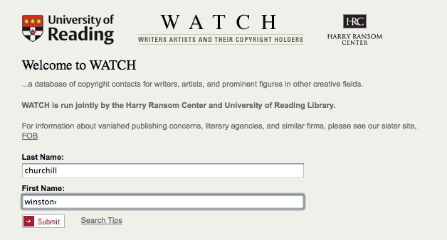
To try it out, I enter Winston Churchill’s name. He was a very quotable person in the 20th century!

Search box for Churchill

Search box for Churchill

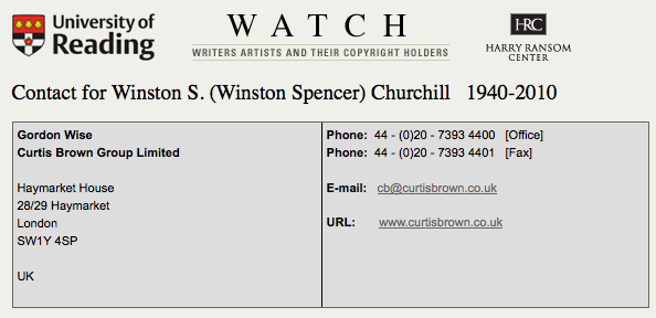
The results in the second box indicate with whom I should check before quoting Churchill, especially for commercial use such as for Zazzle designs. (BTW, I have zero idea if they do grant permission or not; I did not contact them.)

Winston Churchill results

Winston Churchill results

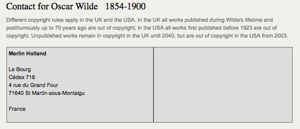
If a search turned up a licensing company, I assume I have to seek permission to use work from that artist or writer. If it turned up blank, I’d think I might be ok, but I learned better with the Oscar Wilde example!

The results for Oscar Wilde are more ambiguous on WATCH because they have notes about differing UK and USA rules AND an address in France! I don’t understand this one at all, I have to say.
Oscar Wilde search results

I used to believe that if a work pre-dated 1923, it was ok to use. Well, maybe. Maybe not. So, I try to check it I’m going to quote someone. I also double-check the source of a quote – you would not believe how many quotes are falsely attributed to Kurt Vonnegut, for instance!)

I, myself, had some Oscar Wilde quotes removed from Zazzle which was a puzzle. Wilde lived from 1854-1900, so his work would ordinarily have gone into public domain by its age. This was one of the tricky ones! I don’t pretend to understand it, but I believe it has more to do with trademark than copyright. This particular writer’s info is perhaps not fully addressed by the WATCH site. (They caution you for good reasons!)

Since I had products taken down, I did a separate Google search on “Oscar Wilde copyright” and was taken to a website of a licensing company, CMG. The Official Web Site of Oscar Wilde has more info (FAQ) and links back to CMG.

 Permission and Zazzle.com

There are differences in using quotes in editorially, commercially and personally, so be sure to check! If you stand to make money utilizing someone else’s words, art, or other creative work, you may very well have to gain permission and possible a licensing agreement. What that entails, you have to find out on an individual basis. If you do pursue it, know that

  • You may or may not get permission.
  • You may or may not be able to afford the conditions under which you could get permission.
  • The cost of not finding out may be even higher, however!

For those of us creating on Zazzle.com: if you have permission to use someone else’s work, you may want to post a notice on your site AND contact Zazzle to show proof of that permission. Zazzle has been known to remove alledgedly offending products without warning and, often, without much recourse for the artist. An ounce of prevention saves a ton of problems later!

On the Zazzle help page,the acceptable content guidelines note:  No text or images that infringe on any intellectual property rights including, but not limited to copyrights, trademarks and rights of privacy/publicity. More info about the Zazzle copyright policy may be found on this help page.

There are always people looking out for other artists who will report designs they think infringe on someone else’s rights. (That’s not the ideal protocol, but it happens.) Additionally, licensing companies may do automated searches of the web to look for possible violators. Zazzle undoubtedly has a list of artists, writers, celebrities, companies, etc whose intellectual property may not be added without permission.

If you have ever had something taken down, you know how troubling that may be. This is one way to help yourself stay out of trouble!

As artists and creators ourselves, we should understand this subject from both sides. 🙂

Note: I am not a lawyer, nor offering legal advice. The information here may be outdated by the time you read this! And IP law is evolving all the time. WATCH is one tool available on line to help you research intellectual property concerns. It’s important to understand that there are different kinds of rights out there and intellectual property law is a complicated subject. Another online tool you should become familiar with besides the Copyright Office noted above is the US Trademark Office search.

5 Zazzle Store Customizations You Must Do!

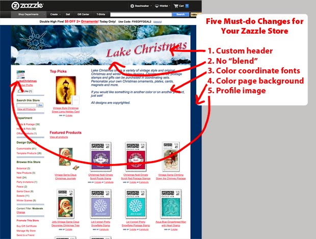
tips for Zazzle store customization

5 must-do tips for Zazzle store customization

No coding required to polish your Zazzle custom store!

You don’t need to know any HTML or CSS to make five of the most important customizations for your Zazzle store.

Many successful sellers have done nothing beyond these changes to customize their stores, so don’t think a really fancy design is crucial to good sales. Just start with these five basic changes. These customizations will help make your site look more professional, showcase your designs AND lead to better sales opportunities!

Zazzle Custom Store Components

To create a Zazzle custom store, these are your essentials:

  • 900px x 200px header with store name or other info uploaded to Zazzle
  • 200px x 200px square profile image uploaded to Zazzle
  • hexadecimal color numbers that coordinate with your header image (see post on Colorzilla for help with this)

If you have these ready to go, it will take about five minutes to customize your store appearance! Go to your Manage My Store link and then Appearance to start your store transformation! [note: There’s a 5 minute video at the bottom of this page on Zazzle Custom Store Tips if you’d rather watch how to do this.]

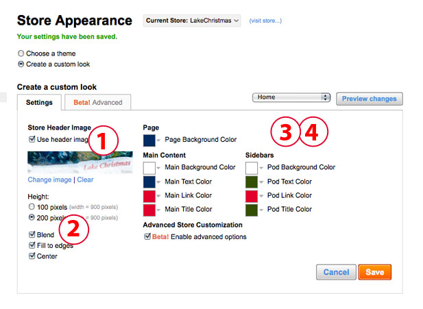
how to make changes 1-4 to your Zazzle store

1. Custom Header

Add a custom header, preferably with your store name and an indication of what’s in your store. You can feature one of your designs or products showcasing your designs. Or you can carry over your branding and colors from another site. No naked people, please, but your other designs should be fine. You can create this in Photoshop, Gimp, Illustrator, etc. Most people choose the 900 x 200px size jpg image. If you have uploaded your header to your Image folder, it’s easy to drop it in here.

You can change your header as many times as you like. Save and click on the blue visit store link to see if it turned out as you planned.

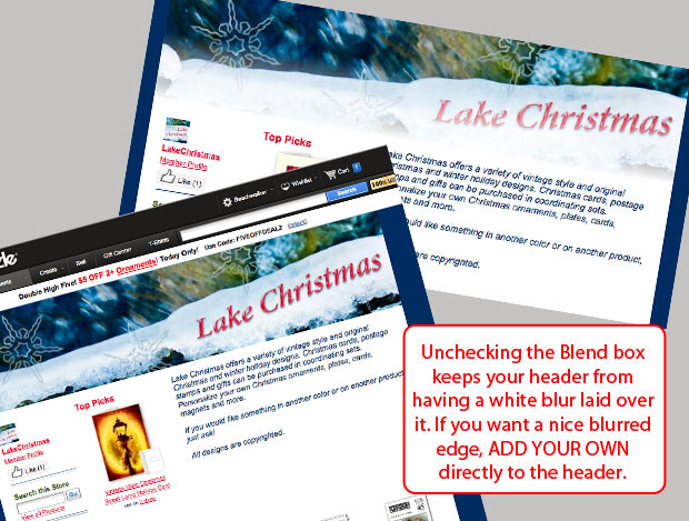
2. Check the Edge Blend

By default, Zazzle adds a white blend edge to the bottom of your header. If it works with your design, awesome! Chances are – it won’t! The soft edge can look very good, but the effect is better if you create it yourself on your header image before you upload it. You can then choose the color and amount of blend. You can also put your text over the blend. I saw another store yesterday where their attractive header design was ruined by not managing this edge! You can leave a hard edge or put any kind of border on the bottom in Photoshop if you prefer.

All you do is UNCHECK the box marked Blend! Please, do this. Your store usually looks lame if you leave it on.


tips-for-store-customization4

See the difference removing the blend option makes!

3.  Coordinate your storefront colors

You can control the text, link and title colors for your storefront and the sidebar (pod) as well as the store and pod background colors. The default colors when you’re in custom mode are fine, but your store will have a more harmonious or dynamic appearance if you coordinate the colors. Keep in mind that people are trained to think of links as blue, so if you have a shade of blue / turquoise / aqua, use that one for the links. A text font in medium gray to black, dark brown or another easily read color is good. You can choose to use your accent color on the titles.

Just be sure that there is good contrast between your link color and your main text. AND that all of your text is easily read against the background colors.

I usually leave the store background white. Why? Because I used to change it to very elegant shades of ecru and toast and aqua. Then Zazzle made changes to the backend and the backgrounds of all my products suddenly went white! Arrrgh! It eventually did get changed, but my store pages had an very unattractive patchwork quilt appearance! I had better things to do than fix that!

So, the simplest choice for your store background is white.

4. Choose a page background

Your page background is different than your store background. The store background is under your images, the page background is outside your storefront. Much of it is not actually visible, depending on the screen size a viewer has. The default color is actually fine, but why settle for fine when you can have coordinated?

Pick out a color which may or may not come from your header image and use that for your background. You can, of course, add a background image or pattern, but that will require you to break into the code. 🙂 A nice color is easy to add. Your options include:

  • blend the page background with the store background color
  • focus attention on your store with a black or other very dark color background
  • drench your store with color

Don’t be afraid to experiment with all the text and background colors. Just be careful!. Red or royal blue on black is hard to read. Light purple is so abused, be careful with it.

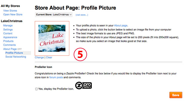
5. Add a profile image

Adding a profile image is the final bit of polish for your initial store customization! In Manage my store, go to the About Page section. Click on Profile Picture and upload your photo. It’s going to drop into a square space and you won’t be able to crop it, so the recommended 200x200px size is perfect.

tips-for-store-customization3

Your profile image, or avatar, can be a

  • photograph of you, your kid or your pet. Head and shoulders, or just a head shot is good. No one says it has to be current.
  • illustration of you, your kid or your pet.
  • logo or other design that fits with the store.

Please, don’t use Mickey Mouse or Felix the Cat. They aren’t yours to use. This is YOUR store, have the profile image indicate something about YOU and/or YOUR STORE.

Ok, done yelling! It’s nuts to see avatars that don’t belong to people on their stores and doesn’t show anything about their work except they know how to copy!

Want more help?

If you would like a store designed for you, contact me and I’ll be happy to create a custom design using your own images or products. If you want to discuss your Zazzle store – its design, content, marketing – you can always ask on the forums. Or you can contact me for some individual coaching over Skype or via messaging.

Watch a quick video on creating your Zazzle custom store here: