topNav

Author Archive | Debra Schmidt

Easy way to pin Zazzle products to Pinterest!

Swimming pool in Costa Rica with Pacific Ocean in the background.

Swimming pool in Costa Rica with Pacific Ocean in the background.

Are you a fan of Pinterest? No, not for saving recipes and collecting photos of places you’d dream about going to if you really wanted to dive with dolphins while wearing your size 4 bikini* and spending all your Zazzle loot. Oh, never mind about the loot. We aren’t making it anyway AND we are going on Pinterest for a totally different reason!

pinterest recipes

For WORK.

Marketing work for promoting your Zazzle products.

A tool for pinning Zazzle products to Pinterest

I’m presuming you already know why you’d want to have a Pinterest business account and how to use it. It’s almost Christmas, you’d better be doing something!

So, all this marketing is a pain, but people do get traffic from Pinterest so it’s worthwhile. I know they send me traffic, but I don’t have any referrals that I can truly trace back to there. I don’t know if they strip the rf codes or not. I check every time AND use a tracking code, but I have no evidence that affiliating from Pinterest works. And no evidence that it doesn’t.

So, this is something we want to make easier, right?

Well, Beck, from PencilPlus, CardFactory, CasePlus and FotoPlus has created a pretty handy tool for searching through Zazzle products and setting them up for affiliating. He posts about it occasionally in the Zazzle forums. The tool is called Zazzle Affiliate Helper and is available on his site, justsoldonzazzle.com.

Today, he added a very sweet feature: the ability to “pin” from the Zazzle Affiliate Helper directly to Pinterest. You don’t have to keep re-doing a search. You pin and go back to the search results, pin again, and so on. Easy!

The tool is free to use. Beck just asks that you pin some of his products while you’re at it. A lot of his fit well onto my LakeEffects boards, so I pinned a bunch tonight.

Here’s an illustrated guide to the pinning process.

Info in the the turquoise colored boxes, but just follow along. Or just wing it yourself!

1. Go to Zazzle Affiliate Helper
ZAH-1

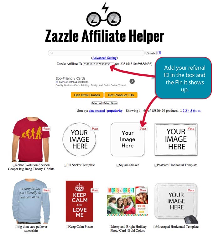
2. Add your associate ID in the box.

ZAH-2

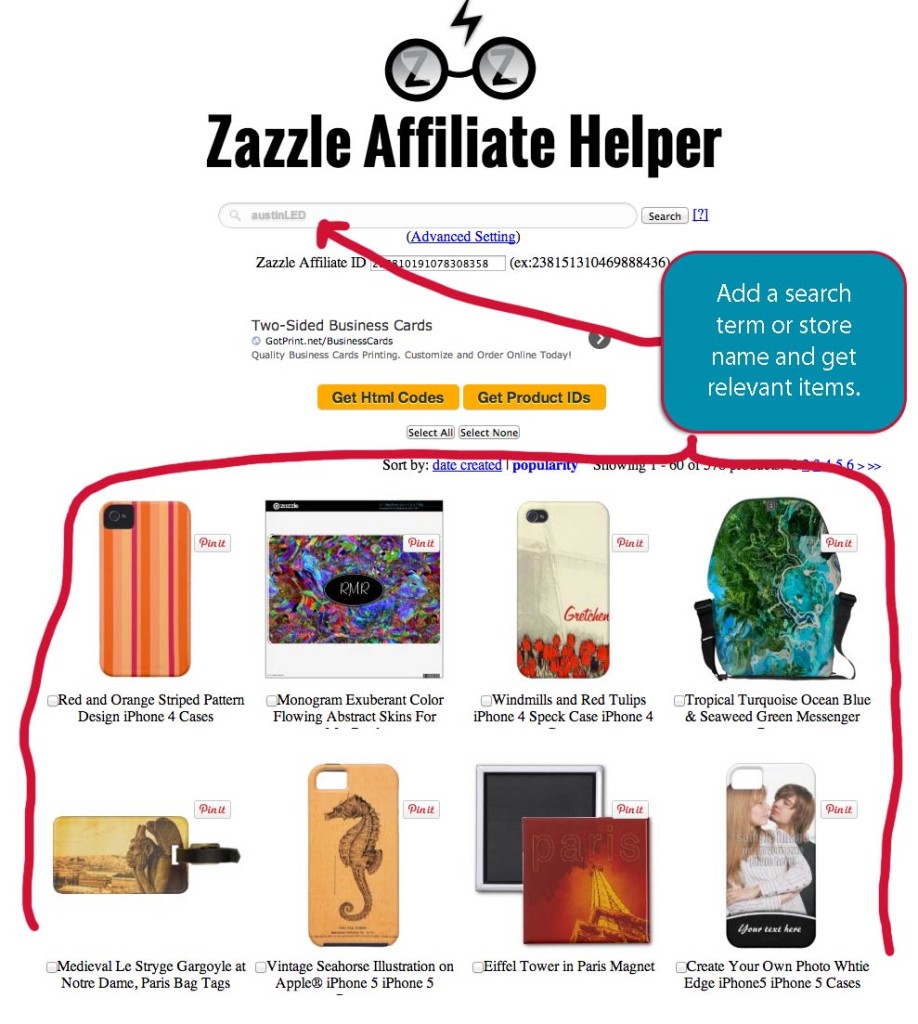
3. Add a search term or store name to the top box.

zah-3

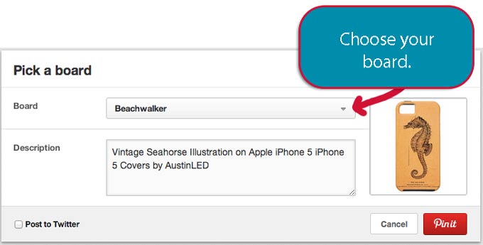
 4. Choose a product. Now pin that Zazzle product and start the pinning process. I chose the seahorse phone case.

zah4

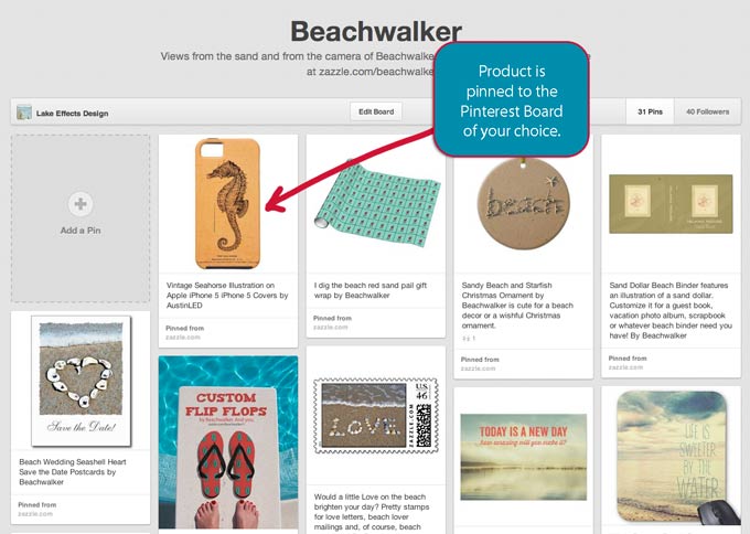
5. The Seahorse phone case shows up on my Beachwalker board.

zah5

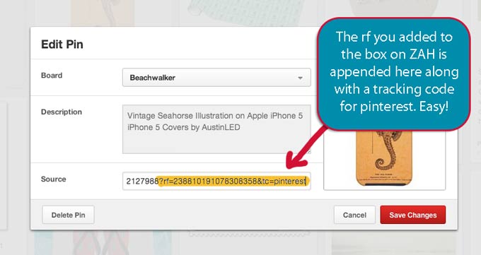
6. Check the source box and note that your referral code is included and so is a Pinterest tracking code. zah-6

7. Rinse and repeat!

I will post back here if I sell any seahorse cases in the next few days!

What about you? Are you seeing good results when you pin Zazzle products to Pinterest? Do you get referrals there? Add a comment if you are – or aren’t.

If this was helpful info to you, please share!

*Pinterest users are 70% women, according to MediaBistro.com (2013). But you knew that, right? And, in the interests of disclosure, I really was in that pool in Costa Rica. My beer is in the photograph; I am not. πŸ™‚


How to increase your Zazzle referral income

Are you a Zazzle.com storekeeper or affiliate? You probably already know how the Zazzle program for referrals works. It’s a way for anyone to earn money through the sales of Zazzle products. Got a website? Create an ad on it. Hanging out on Pinterest or Google+ or Facebook? Post links to products you like or that you think your audience will buy. Do let people know that links are potential money-makers for you – it’s polite and the FTC says it’s the right thing to do.

If you’re an artist, you can let people know they can refer your work so you both earn money when a product sells.

Are there ways to increase your Zazzle referral income?

Are you expecting the Zazzle.com affiliate program to do things it’s not meant to do? Or things it’s unable to do?

Of course, not. Right?

Are you sure?

Three pieces of advice:

  1. Understand the program.
  2. Right-size your expectations.
  3. Plug the leaks

If you can manage to get the Zazzle.com referral system down, you will make more money on Zazzle. Referrals are paid out at 15% of the base price (the only good thing about the recent price increase) so you may make more in referral than royalty. There used to be this nice volume bonus program . . . oh, wait, there still is a volume bonus program. It’s just not that nice anymore, but the only way it does work now is if you refer the product.

Earnings are maximized if you refer your own product. Many people concentrate on marketing OR designing, however. They both take time and they call for different skills.

Let’s start with the new news about referrals – a contest!

The Zazzle referral contest for October

Zazzle.com recently announced a surprise contest, Awards for Associate Superstars, on their blog. Associates with the most referrals at the end of October can get a share of $500 worth of AMEX cards.

It hasn’t gone over very well among the vocal storekeepers (SKs) and the details are sketchy. . .

How this is supposed to work: the most dollars earned in referrals? the most number of referred sales? the most volume of referred products?

And – are the big affiliates included, the ones who earn tens of thousands of dollars plus each month in referrals? This probability really made people shrug off this contest. It’s already won, right? And what is $200 to anyone at that level?

[edited to add: Clarification posted in the public Zazzle forums that the person with the highest number of referrals will win.]

Nevertheless,  the announcement of this contest is a good reminder to us to step up our referrals game! Especially with the holiday season upon us!

Should you pay for advertising to get referrals?

A Zazzle blogger, Elizabeth P, is now suggesting taking out Facebook and/or Google ads. Yikes! Don’t think about cliff-diving into those waters until you know how to swim first.

Personally, I have not done either yet. Taken out Facebook or Google ads, I mean. I did jump off a cliff once (this one), but it wasn’t that high and I was drinking and succumbed to peer pressure. Don’t you drink and dive!!! I gave it up, myself.

Your marketing skills and products should be pretty solid before you move to paid ads, IMO. Facebook and Google ads can be a crapshoot (i.e., risky venture). All I know is, if you don’t set limits, you could be very sorry. There are plenty of ways to get your feet wet and improve your marketing skills before you start shelling out money. If you’re ready for paid ads, you probably already know it and are doing it. The big affiliates spend scary amounts of money on marketing, but they are doing so with a solid base of knowledge of where and how to market and what to promote. In other words, actual statistics are playing a big role in their success.

Basic referral linking

Creating referral links properly is the very first way to increase your Zazzle referral income! And it’s free! Ensure you create working referral links whether for websites, social media, email, etc, before you move on to anything else. Referrals won’t work everywhere because some sites strip out referral codes, but you’ll increase your chances of earning a referral. In fact referrals are very touchy: if a customer has cookies turned off, switches computers, substitutes their own rf code, etc, you are SOL. You can only work on that which is under your control.

The hard truth is: you will not get every referral you think you earned on Zazzle.

I’m assuming you’re already pretty familiar with this info, but I’ll just note the basics. The best way to create referral links is to use tools that do it for you. The Zazzle sharing tools for products are super quick and easy to use. Or there are scripts, like the free Rob Greenleaf link-builder, that you can set up. You can also hand-code your links – try a copy-and-paste method to avoid typos and other errors.

Would you be surprised that not everyone does this right? I have a friend on a Zazzle-related forum who argues that she never gets any referrals. Out of curiosity, I took a look at her website.

That is, I looked at the code. This is super-easy to do! I poke around the back end of websites all the time.

Sneak a peek behind the code curtains

Depending on your operating system and/or browser, you will find the source code in different ways. You want to access View Source.

A free extension on Firefox or Chrome,Web Developer by Chris Pederrick, is one easy way to check. On Chrome, Web Developer will install a little gear wheel near the URL box. On Firefox, you have the option to display an entire toolbar for Web Developer.

In Web Developer, look for “View Source”. This will open a new page that shows all the code for the page you were looking at. This is how reverse-engineering and bug-fixing starts. Don’t worry about understanding all of it. We are looking for for specific bits of code. You do know how to do a search, right? (cmd+F or cmd+G works on a Mac)

Now, search the source page for “zazzle.com”. Every single linked instance of Zazzle.com on that page should include a referral link. If it doesn’t, you are already shooting yourself in the foot and cliff diving would be redundantly dangerous.

Here are examples of auto-generated links to which I added the tracking code.

zazzle.com site => http://www.zazzle.com/?rf=238810191078308358&tc=RBLTpost
zazzle.com store => http://www.zazzle.com/beachwalker?rf=238810191078308358&tc=RBLTpost
zazzle.com product => http://www.zazzle.com/custom_photo_text_christmas_ornament-175729008648190128?rf=238810191078308358&tc=RBLTblog

source code

Example of source code for above text.

That’s the source code for the links and paragraph above. Notice the color coding that shows your links in blue. What happened to the ampersand? It turns into & [which is the ASCII code for an ampersand. Thank you, Circus Valley!]. The target=”_blank” means the link will open in a new tab.  

Note that a page or product link has a specific format: after the URL, parameters perform extra functions. For Zazzlers, these functions can include referral (associate) ID, tracking code, promotional code, campaign code and so on. The first attached item after the URL gets a ? before it. All subsequent items each start with & and may be in any order. Zazzle gives the details on your Associates page (yes, that is a referral link! Why not?).

Do you know what your associate ID looks like? I don’t have mine memorized, but I do know the first and last bits of the number. Here are two examples of referral links to a store. Zazzle uses both when creating links for you. The asterisk is valid, but may be stripped out more often than the rf code. It does look better on business cards and such, however.

  • http://www.zazzle.com/beachwalker*
  • http://www.zazzle.com/beachwalker?rf=238810191078308358

Tracking codes (tc) will show up on your earnings report so you know which links are leading to sales. Typical tracking codes might be FB (Facebook), PIN (Pinterest), email. Add your tc like this:

  • http://www.zazzle.com/beachwalker?rf=238810191078308358&tc=myblog

So, looking at my friend’s site again. . .

Bad news. She’s missing a bunch of ampersands with her parameters – they aren’t separated from each other. I’m pretty sure that kills the referral aspect!

Don’t be stupid nice, just be nice

Are you sending customers to links on the Zazzle coupon page?

Why?

Seriously, why are you doing that? It’s a big distraction and you risk not only decreasing your income, but also losing the customer to the next bright shiny object! Be strategic and creative about how you share cost savings opportunities. Look for a win-win opportunity instead of giving money away.

OK, you want to be nice.

Just don’t be so nice that you don’t include a referral code when you share coupon or discount information!

Sigh. My friend did that, too. She had links to the coupon page with no referral code. At least if you’re throwing money out the window, you can watch how happy you make some people walking by.

If you throw money away to Zazzle, they just add it to the vault and go back to riding their fixie bikes into the California sunshine life and cuddling Smushimals while eating custom chocolate bars in colorful hammocks. (LOL – see how easy it is to add referral links? Those are all new Zazzle products.)

EVERY time you link to Zazzle on your site, make sure you include your affiliate link. Yes, I’m repeating myself!

Stop all the leaks – here’s a new one!

Did you ever have a favorite pair of jeans that you wore until they turned white and were as thin and fragile as butterfly wings? Probably the pockets had holes in them by then and sometimes you’d forget and stick a handful of change in your right front pocket.

Ping! Ching!

Money would slide out of your pocket and you maybe never noticed.  That is what can easily happen with referral links.

So, what makes your Zazzle system leak? Improperly coded links and missing rf codes are the biggies that you can control.

One new phenomenon I discovered recently – to my dismay – is on my own site. You know how Zazzle updated everything this summer? They also updated some of the banners. Banners are free tools for us to use: advertisements for categories of gifts (Mother’s Day, Christmas, etc) that you can add to your website. See examples in the right-hand column.

You won’t earn Zazzle referrals this way!

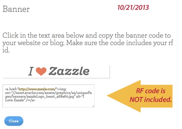
Anyway, I was doing a View Source on my own page and was shocked to see that a new stock Zazzle banner I had added had NO REFERRAL CODE.

What? Zazzle always included your code automatically for you just like on the sharing buttons. They SAY they include it, but it’s not there. . This is what I call a half-broken tool. That’s dangerous, because you think it works and it hurts you instead.

See for yourself.
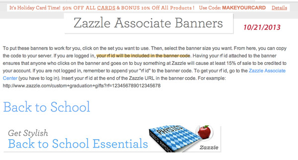
From the Associates banner page on Zazzle
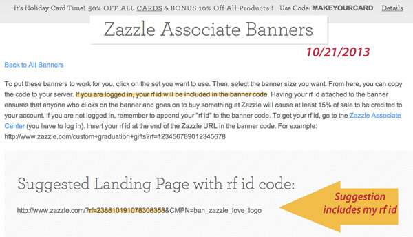
From the Associates banner page on Zazzle
 

banner-rf-code-2

banner-rf-code-3

Well! That’s not very nice. They say it’s there, but it’s not.

So, check all your banners, especially the new ones. The old ones kept the referral codes intact and they still work.

There have been a lot of disconnects on Zazzle with all the changes. You can see my comments as Beachwalker about these on the Zazzle public forum. I honestly don’t know what to think about this one, but it does not give me a warm fuzzy feeling. It’s kinda cold like that Lake Superior water down at the bottom of the cliff I jumped off. (You know I didn’t actually dive, right?)

However, you probably want to add a tracking code anyway, so check and make sure all your links, whether text or banner, do include your affiliate code. This is like putting on your water shoes before you go near that cliff. πŸ™‚

What else about Zazzle referrals?

There is a lot to learn and know about Zazzle referrals. Things change, too: the old zbar seems obsolete now. There are ways to structure referral links, use shortened links and include promotional codes. Some social media (Wanelo, sometimes Facebook or Pinterest or Twitter) sites strip the rf codes. Unscrupulous people strip and replace them with their own. There are sharks in the water at the bottom of that cliff!

I am no expert coder and I don’t make tons of money with referrals, but I’m getting better at it. People at Zazzle and associated with Zazzle have developed a variety of tools to help with referring and I suggest you check them out and keep learning. If you have recommendations, please add them in the comments. This is by no means an all-inclusive on referrals.

Even if you and I have no chance to win $200 in the contest, more referrals = more money!

Happy referring! If you liked this post, please share it!
 

Zazzle’s New Design Tool 2013

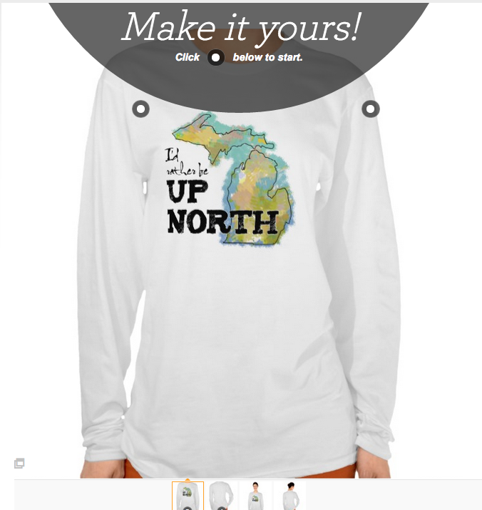
shirt with new Zazzle design tool

Shirt shows new design tool on Chrome browser.

Has it happened to you yet?

You open a product on your  store – or you go to buy one on someone else’s store and. . . it happens. You are not in Oz anymore and Toto has left town.

Actually, maybe you are in Oz now, because things got weird. Instead of clicking your heels, however, you are pounding your head on the desk.

Zazzle has a new design tool

You know how this works. Zazzle cooks up new stuff and then lets guinea pigs various storekeepers and customers sample the brews on random browser tests. The new design might appear on one browser and not another. Clearing your cache and cookies may get you out of it, or may not.

So, what is the latest version of the design tool? And is it going to be something to look forward to?

Hint: they’ve apparently hired video game designers and people who like secret codes. And Twister.

So, you know you have the new tool when. . .

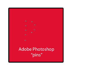
Appearance of puppet warp "pins"

Appearance of puppet warp “pins”

Messages are popping up and down and jumping out from all over the screen. Familiar actions are gone, new ones are in their place. The strangest is the unlabeled pins stuck on the products and the unlabeled circles you will encounter in the design view. Maybe these have a code name, but I’m calling them pins. They look like the pins from the Adobe Photoshop’s Puppet Warp tool. Or from Lightroom’s spot removal pins.

The messages stop popping up after a few seconds and stay gone. In order to determine what to do, you have to test everything. Nothing is labeled until and unless you mouse over it.

It’s like a treasure hunt, but you don’t see little jewels and hats and vials of poison, you see pins that all look alike. There are a lot of opportunities to put objects in position. You’ll see.

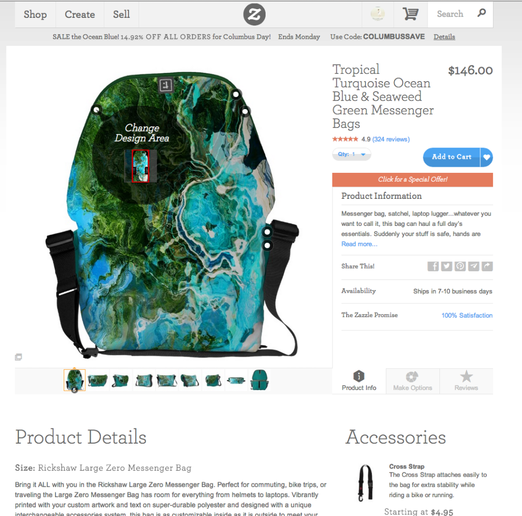
The new tool was initially implemented on mugs and then t-shirts and is being fine-tuned along the way. There may be differences, therefore, when you encounter it! I found out today that Rickshaw messenger bags show it when I decided to share the sale of one on my Pinterest board. Yikes!

Tropical Turquoise Ocean Blue & Seaweed Green Messenger Bags

The screen immediately began tossing random info at me as you can see by the overlay info in the image below. You can see another of the pop-ups in the t-shirt image at the top of this page.

Zazzle design tool

Watch the use of this tool on video

If you want a peek at how the tool works and it’s not showing on your browser yet, below you will find a long video of me fumbling my way through it. And mind you, I had already seen this tool on t-shirts, so I was not totally new to it! I don’t know how customers will like customizing with this new method, but it adds many steps to the process for designers. I do point out the new way to post a product for sale. You could say it’s hidden.

Zazzle tests all these permutations, so presumably they will get it right in the end.

My feelings will not be hurt if you don’t watch all twenty minutes of this video. Unless you’re from Zazzle – you SHOULD watch it. I believe I constrained myself to one actual swear word (pats self on back).

Note: this screencast is not only long, but also done on software new to me, so it doesn’t have a pretty cover or fancy ending. Oh well.

Was this helpful? Please comment below or share!

What does the Zazzle Volume Bonus change really mean?

*** note: this post is a bit of an info-rant ***

Zazzle.comΒ will send out September checks and PayPal deposits in two weeks for July sales.

This will be the first month with zero – or almost zero – Volume Bonus in the payments of many Zazzle storekeepers (SK). For me, it will be the first time since February 2009 that I won’t get any Volume Bonus.

It’s going to hurt. Some of us will be hurt more than others, but anyone who had halfway decent sales is kissing significant money good-bye.

That’s how it works when you’re not in charge, isn’t it? We don’t negotiate these deals, we just pray not to be dropped too hard.

Are you at the mercy of those bigger than you?

Are you at the mercy of those bigger than you?

Β What Zazzle was up to this summer

If you have been on Zazzle for awhile and paying attention, you know about the constant changes. That is simply how internet-based companies operate. Plus, they make changes in the summer in order to be prepared for the holiday season. Starting late last fall, there was a tremendous surge of downward pricing pressure put on storekeepers with implied promises that everyone would “make it up in volume,” and threats that no affiliates would refer your products if you didn’t lower your royalties below 25%. Then 15%. Then 13.3%. Now 10% with 5% on the horizon.

In June, Zazzle SKs and affiliates got official notification of this summer’s changes. Mega-changes and definitely not to the benefit of storekeepers. At least, not that we can see.

The entire Zazzle architecture was re-done with limited apparent input from UX experts. The storefronts changed – SK customization was wiped out overnight and stores became pasty pale shadows of their former selves. (Thankfully, SK protests were heeded and the colors revised!) The Zazzle look itself got stunningly attractive. (They have got some great product photographers and product displays being shown.)

Across-the-board 5% price increases went into effect. Base royalty prices dropped from 10% to 5%. The 5% high-royalty penalty kicks in at 15% instead of 20.1%. The design tools changed. The font tool, especially, went to hell. That was all fun.

Not.

Re-cap of what happened to the Zazzle Volume Bonus

The biggest impact for many SKs, however, is the change to the Volume Bonus. To give you an idea, many SKs have compared it to “what CafePress did to us” several years ago. [In 2009 CafePress changed their royalty policy and put a lot of people out of business and shocked and angered many more. A lot of those designers fled to Zazzle as a safe haven. I was one of those already on Zazzle who bailed out of CP.]

The generous Volume Bonus (VB) that we all loved has, essentially, been done away with. We Zazzle storekeepers and affiliates used to get VB for sales we referred as well as for our own sales that had not been referred. It could add up to a nice bit of change if you were a solid seller. That is hundreds or thousands of dollars each month could have been earned solely from VB. The more you sold, the higher the percentage of VB as well. It was really nice at the holidays.

Well, that’s gone. Some people are going to sink.

Is your vessel in danger of capsizing?

Is your vessel in danger of capsizing?

What’s left is a new and eviscerated version of VB. Here’s how it is more politically described on the Zazzle blog:

Volume Bonus Becomes Associate Volume Bonus (from the Zazzle blog)

We’re committed to providing strong incentives to all Zazzle community members to encourage each person to put in the extra effort in generating more awareness for products on Zazzle. With that in mind, starting July 1st, the current volume bonus structure will be transitioned to a Zazzle Associate Bonus Program. You can make money by referring customers to Zazzle. We believe that this new program will align the Zazzle community around generating the most revenue from referred traffic [emphasis added]. As a Zazzle Seller you are already enrolled in this new program!

In a nutshell, Zazzle doesn’t need more artists. Creators are a dime a dozen and expendable. What it needs are marketers who promote products.

Here are the details laid out in the new Volume Bonus Program Terms published by Zazzle,

The Bonus will be calculated as a percentage of Base Sales on a domain-by-domain and currency-by-currency basis as follows:

1% of Base Sales for Base Sales in the applicable month from $100 to $999.99; plus
5% of Base Sales for Base Sales in the applicable month from $1,000 to $4,999.99; plus
12% of Base Sales for Base Sales in the applicable month from $5,000 to $99,999.99; plus
17% of Base Sales for Base Sales in the applicable month $100,000 and above.

Base Sales means the purchase price received from the customer less the Markup Amount; amounts charged for shipping, handling, packaging, insurance, and sales or similar taxes; refunds, credits, and reversals; and the face value of the postage (if the revenue is for Zazzle Custom Stamps). The Markup Amount means the purchase price multiplied by either the Royalty Rate applicable to the product sale or the Standard Royalty Rate in the case of the sale of a private product.

So, if I’m figuring this right, the Volume Bonus has been negatively impacted by three factors:

  1. It only applies to sales for which you get credit for the referral instead of everything that wasn’t referred.
  2. The percentages dropped. A lot.
  3. The percentages are applied on a lower base price now (5% instead of 10%)

IfΒ  you want to torture yourself without banging your head on your desk, read theΒ Previous Volume Bonus Program Terms here:

Volume Bonus Program prior to July 1st

To recognize Sellers and Associates who make Zazzle successful, we offer the following volume bonus program.The following terms of this agreement (“Agreement”) apply if you create public products, design(s) or art for sale on the websites owned or operated by or for Zazzle Inc. (“Zazzle”) and/or participate in the Zazzle Associates Program.Every month, Zazzle will pay you a bonus amount (“Bonus”) based upon the following sales:

  1. A sale of a product for which you earned a Royalty, which was not subject to a Referral Carve out (as defined in the Non-exclusive License Agreement); OR
  2. A sale of a product for which you earned a referral fee.

The Bonus will be calculated as percentage of Base Sales on a domain-by-domain and currency-by-currency basis as follows:

  1. 7% of Base Sales for Base Sales in the applicable month from $100 to $999.99; plus
  2. 12% of Base Sales for Base Sales in the applicable month from $1000 to $4999.99; plus
  3. 17% of Base Sales for Base Sales in the applicable month $5,000 and over.

Base Sales means the purchase price received from the customer less the Markup Amount; amounts charged for shipping, handling, packaging, insurance, and sales or similar taxes; refunds, credits, and reversals; and the face value of the postage (if the revenue is for Zazzle Custom Stamps). The Markup Amount means the purchase price multiplied by either the Royalty Rate applicable to the product sale or the Standard Royalty Rate in the case of the sale of a private product.

You want it spelled out in dollars and cents?

OK, here’s a couple of examples of what the change in Zazzle Volume Bonus means for a moderate and a very good seller. Assume all sales were U.S.A. based and evenly split among self-referred, 3rd party referred and not referred. These are all rough samples and do not take all the nuances into account. That said, they are, to the best of my knowledge, what we called “directionally correct” where I used to work.

Example 1. A moderate seller who is covering maybe the car payment and groceries and a few extras with their Zazzle income. She has sold $3000 in BASE sales of Zazzle merchandise.

Under the old plan, she would get a volume bonus based on 2/3 of that $3000.

  • 7% VB on $900 = $63.
  • 12% VB on $1000 = $120
  • Total VB = $183

Under the new plan, she would get a VB based on only 1/3 of that $3000, or $1000 is VB eligible. Actually, with the increased prices and the decreased base price, the math gets way crazy.

  • 1% on $900 = $9
  • Total VB ≀ $9

Her royalty check could vary widely with those sales, based on how she has prices set, but let’s say it was $600. The $183 in VB was a nice add and buys groceries. That’s a 20+% drop in income.

Example 2. A good seller who makes a living from Zazzle. She has sold $30,000 in in BASE sales. That’s maybe $6000 in commission.

Under the old plan, she would get a volume bonus based on 2/3 of that $30,000. That’s $20,000.

  • 7% VB on $900 = $63.
  • 12% VB on $4000 = $480
  • 17% VB on $15,000 = $2550.
  • Total VB = $3093

Under the new plan, she would get a VB based on only 1/3 or $10,000.

  • 1% on $900 = $9
  • 5% on $4000 = $200
  • 12% on $10,000 = $120
  • Total VB ≀ $329 (again, not taking the price changes into account)

Well, to put it bluntly – that sucks.

How are you handling the change in Zazzle Volume Bonus terms?

Based on way-too-extensive forum readings, Zazzle storekeepers are suffering the stages of grief: Denial. Anger. Bargaining. Depression. Acceptance. Some of them are making others of us crazy (crazier).

So, you suffer. And then you do something. Right now, IMO, SKs fall into these categories of cliche:

  1. Ignorance is bliss. “Hey, did I miss something? I haven’t been reading my emails or checking out the forums.”
  2. The good soldier. “Zazzle’s been good to me so far. I will trust they are doing what is best. I will carry on my mission to bring cartoon donkey designs to the masses. PBJ sandwiches are good enough.”
  3. The grass is still greener.Β  “Yeah, it sucks that Zazzle has arbitrarily cut my income by 10% or 30%, but it still seems the best POD out there. I’m glad we have another income.”
  4. Eggs in one basket. “Where can I find other baskets like this one used to be where I can put my precious designs? I didn’t know they could step on the basket and crush it!”
  5. Exit, stage left? “It’s been nice to work from home and take of my kids, my mom, my garden, but it’s not going to work anymore. I’m outta here.”
  6. Panickers. “OMG! I am disabled and/or unemployable. What will I do with a big cut to my Zazzle income?”
  7. Stock-takers. “OK, this is bad, but Zazzle is still be one of my income and artistic-expression options. Now, what can I do to make it less-bad?”
  8. Shruggers. “I wasn’t making any money with Zazzle anyway, so I’m only losing a dollar or two each month.”
  9. Pollyanna. “I’ll just work harder and make it up on volume. I think I can! I think I can!” (OK, that became the Little Engine that Could but you’d have to know that it was possible before you tell that story, right?)
  10. Newbies.Β  “I won’t miss what I didn’t have.”

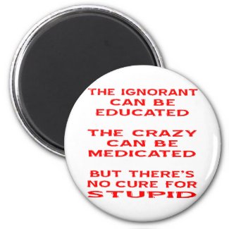
I had a category for Idiots and Whiners, but that was non-productive. There’s no cure for stupid, anyway.

Still in the game?

OK, you’ve taken a deep breath. You’ve decided you’re still in this game. Whether you are a Stock-taker, Pollyanna or Panicker, you want to learn to play better, even if you play less and turn your focus elsewhere. What can you do? On Zazzle, specifically, that is.

First, consider what variables do we, as storekeepers, control?

We control the designs we create or license, the way we apply them to products, when we add new products, how many products we generate, how we title, describe, categorize and tag them, how we promote them and how we price them. With those factors, making more money (or getting back to where we were) means that we have four levers to pull:

  1. Sell more
  2. Refer more
  3. Pricing optimization
  4. Timing

So, withΒ Zazzle.com referrals becoming more important to earning an income online with the POD business, we have to make sure we get the ones we work for. The next post has some info you may not have realized about getting the referrals you work for.

sailboat

Can you change tactics and set sail again?


Do you know what your Zazzle invitation paper looks like?

Recycled Desert Environment paper

Recycled Desert Environment paper

New invitation paper at Zazzle

The Zazzle invitation paper selection has been increased to eight different types (not counting Speckled since it’s been out of stock for ages). I don’t know if there are new suppliers or what – this change happened last week. The textures have gotten much more interesting! I ordered a selection of all of them and can’t wait to get my hands on them. For us tactile people, new paper is exciting!

I created color swatch / photograph samples of all the variations and ordered them so I will be able to see exactly how the colors and textures affect designs. In the bottom right corner of each invite is the paper type and color name. Trust me, none of us will recognize each of them for sure for a long time. You probably want to get your hands on at least some of these as well!

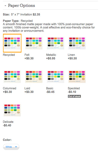
Zazzle invitation paper menu

Zazzle invitation paper menu

Papers range from an affordable smooth basic paper to textured, art paper style, watermarked and shimmery metallic. There are also two choices of recycled paper. The Desert Environment option (top image) looks beautiful to me! Wouldn’t it look great with a line drawing and minimal colors?

Tip: The drop down menu for color choices is all the way at the bottom – you have to SCROLL! It only shows if there is a choice of colors available.

Zazzle Invitation Paper Styles and Colors

Paper Type: Basic in White

A crisp professional paper with a smooth matte finish designed for vibrant full-color printing. 110lb cover-weight. 50% recycled content (10% post-consumer and 40% pre-consumer waste).

Color Sample Basic Announcements

Paper Type: Delicate in Grooved White and Champagne

(edited to add this descripton 8/5/13)

Grooved: A bright, delicate paper made with embossed horizontal grooves and a matte finish. Elegant, yet lightweight enough to be incorporated easily into DIY wedding, birthday, and event invitations. 80lb text-weight.

Champagne: A warm, delicate paper made with smooth texture and matte finish. Elegant, yet lightweight enough to be incorporated easily into DIY wedding, birthday, and event invitations. 80lb text-weight.

Color Sample Delicate Grooved White Personalized Invite Color Sample Delicate Champagne Announcements

Paper Type: Recycled in White and Desert Environmental

A smooth finished matte paper made with 100% post-consumer paper content. 100lb cover-weight. A cost effective and eco-friendly choice for any invitation or announcement.
Color Sample Recycled White Cards Color Sample Recycled Desert Environmental Announcement

Paper Type: Felt in Bright, Warm and Cream

A warm, buff-toned paper featuring an embossed finish that feels just like fine art paper. 100lb cover-weight. Perfect for wedding invitations or party invitations.
Color Sample Felt Bright Custom Invitations Color Sample Felt Warm Invite Color Sample Felt Cream Custom Invites

Paper Type: Columned in White

A sustainable cotton blended paper featuring vertical columns texture and a matte finish. Always a classic choice, this paper’s texture and thickness is great for formal weddings and parties. 110lb cover-weight. 25% cotton, 50% post-consumer content. (note: the columns are vertical on the vertical invitations and horizontal on horizontal. πŸ™‚ )
Color Sample Columned Invitations

Paper Type: Laid in Ivory and Speckled

Designed to harken back to the first hand-made papers, this paper features a laid watermark and matte finish. This luxury paper is great for creating invitations and announcements with an ageless, bespoke look and feel. 80lb cover-weight. 30% post-consumer content.
Color Sample Laid Ivory Personalized Announcements Color Sample Laid Speckled Announcements

Paper Type: Linen in White, Bright, Warm and Pearl

An elegant paper made with beautiful linen texture of embossed lines and a matte finish. 90lb cover-weight. Perfect for wedding invitations and most formal occasions. (note: Pearl is a premium color)
Color Sample Linen White Custom Invitations Color Sample Linen Bright Announcements Color Sample Linen Warm Personalized Invites Color Sample Linen Pearl Custom Invites

Paper Type: Metallic in Ice, Silver, Champagne and Gold

A shimmery paper featuring a distinctive tint and smooth finish. 110lb cover-weight. Perfect for adding a bright shine to your invitations and announcements.
Color Sample Metallic Ice Invites Color Sample Metallic Silver Custom Announcements Color Sample Metallic Champagne Personalized Invitations Color Sample Metallic Gold Personalized Announcement
The total available variety of paper and color combination is now 19 choices!

So, what does this mean to you as a designer or buyer of custom invitations?

Well, it might mean you are designing in the dark – and buying likewise – if you don’t have samples of the paper choices and an idea how they change the colors and might affect how a very fine line font appears on the paper. If you are a designer, you could make a set of papers for yourself with a selection of colors. This is time-consuming, but worthwhile. Or you can order a selection of these and save yourself some of the work.

Some of the colors change significantly when you change the paper.

And white disappears!

White takes on the color of the paper, so if you want white, plan ahead. You can see on the back of one of these invites that there is no difference between clear and white. However, there are still many choices for white papers:

  • Basic White
  • Delicate Grooved White
  • Recycled White
  • Felt Bright
  • Columned
  • Linen (all four choices are pretty close to white, just warmer and cooler shades)

What about the prices of the new invitation papers?

Pricing depends on so many things!

  1. Invitation size – the eight sizes of paper have different prices
  2. Paper style and color – six tiers (see below)
  3. Quantity – volume or bulk discount available
  4. Designer – designers may set prices based upon the design style
  5. Promotions – available sales or coupons

There are six tiers of price of invitation papers. From least expensive to the most premium price:

  • Basic White
  • Delicate Champagne / Grooved White
  • Recycled White
  • Recycled Desert Environment, Laid, Felt, Columned, Linen White / Warm/Bright
  • Linen Pearl
  • Metallic Ice / Silver / Gold / Champagne

New invitation policy at Zazzle

Customers and designers can now order just one invitation as a sample. In the past, everyone had to order at least ten invitations. You could always return them if you didn’t like them, but it was still a bit of a hassle. Now designers, brides, moms, party-givers and anyone else can order sample invitations. You still get a volume discount even if you order different invitations!

Are there sample-samples or kits available?

Zazzle used to offer a wedding kit with sample papers and stickers and such, but it has been discontinued. You can make your own samples as I have done here, order one of your invitations on a variety of papers or order a selection of these. You may want to order different sizes as well. It’s surprising how small the 3.5 x 5″ invite really is, for example, when you actually see it. That size is popular for RSVP cards, but not so much for invitations.

If you make your own, be sure to include a labeled selection of colors, some fine text AND the name of the paper type. Also, add a photograph if any of your designs include them! An image that includes a person’s face will tell you how you’d like that paper. This would be important especially for Save the Date or Graduation announcements where photos template designs are very popular.

Or you can order these already done from my Beachwalker store’s color samples– I won’t mind! LOL

Variation among papers on a photograph

Variation among papers on a photograph


Great deal on webhosting today only!

Can I get a good web host at a great price?

The question of where to host a WordPress website – or any blog or site – comes up a lot. People ask about web hosting in the Zazzle forums all the time. They ask on Facebook all the time. Everyone you turn, new wannabe website owners and dis-satisfied website owners are looking for recommendations about web hosts.

One of my favorite webhosts, HostGator out of Houston, Texas, is having a fantastic sale today!

51% off new hosting packages!

I’ve tried several other website hosts, but have been quite happy with HostGator. The cPanel makes it easy to use and it comes with free email. I use them for most of my WordPress websites. And I’ve called them at 1 o’clock in the morning and gotten just the help I needed, too.

Check them out and save a lot today!

gif-2

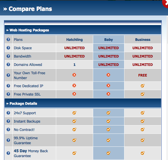
When you go to the HostGator site, click on the blue sign the alligator is holding to be taken to the three packages available. I recommend the Baby Plan if you think you’ll want two or more websites – you can have an umlimited number!

Here’s a partial comparison of the difference between HostGator’s webhosting packages:
Screen Shot 2013-05-29 at 4.19.37 PM

The 51% off webhosting at HostGator applies to your first invoice and is on new or additional hosting accounts. See the HostGator page for all the details.

This deal expires at midnight Central time!

Zazzle Wall Decals – Enough to Make Your Head Explode!

Wall decals were wildly anticipated on Zazzle last year, but I don’t find many people designing a lot of them. I asked in one of the Zazzle forums and several other sellers said exactly what I was thinking about the Zazzle wall decal shapes.

Too many designs! I was overwhelmed and hardly made any.

I liked the idea of the wall decals so much that I decided to conquer the overwhelm for myself.

Why choose wall decals for your decorating needs?

What’s cool about wall decals? If you live in an apartment or dorm or are just scared of commitment, plenty! They are movable and re-movable, up to 100 times. (Please don’t be that crazy!) No holes in the wall. Bright beautiful colors. Fun shapes. Reasonable prices.

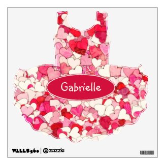
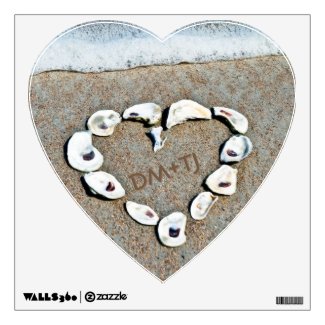
Wall decals are fun for kids to personalize their rooms. Names, photos of favorite people or places can be easily turned into decals. No frames, no fuss!

I also like the idea of putting a decal above a baby crib or changing table. Even the most wiggly baby or clumsy diaper changer is not going to knock a decal off the wall, so I add safety to the list of things I like about them. I guess they probably wouldn’t fall off your wall in an earthquake either, but that’s a bit more extreme!

You could use decals for weddings, birthday parties, graduations and other events where you want temporary or movable signs or art. This would be a great way to lift your party above the ordinary!

The decals, from my understanding, have white backgrounds, not clear, so you likely want a design to go edge to edge. This makes them less desirable for the popular phrase-style decorating. They’re much better suited to images and colors.

Ok, how many decals are there? About 335 styles! Most come in 3 sizes. Sizes ranges from 12×12″ squares to 48×72″ rectangles. Or 1 square foot up to 4 by 6 feet huge! Prices start at $16.95 for the smallest size. The huge ones do get pricey, so make sure you’ve got a design you love!

Designs are offered as singles or multiple designs on one sheet.

Categories include:

  • Alphabet (big, blocky sans-serif letters)
  • Numbers (big, blocky sans-serif numbers)
  • Animals
  • Business
  • Fashion
  • Food & Drink
  • Holiday & Events
  • Insects (these are CUTE)
  • Military
  • Miscellaneous (yes, you could choose a mustache or a monster)
  • Nature (Leaves to the Man in the Moon)
  • Shapes & Symbols (Circles to Stars to Diamonds)
  • Sports & Activities (Baseball bats to Tutus)
  • Transportation (Cars, Trains and Planes)
  • plus a few others

Beat the Zazzle Wall Decal Shapes Overwhelm

One reason the Zazzle wall decal shapes are overwhelming is the way you have to go through three drop-down menus to find a shape. It’s annoying. So, I decided (left brain at work here!) to have one annoying session and create a list of all the options.

Want to try designing your own? Here’s the link: Zazzle Custom Wall Decals Create

If you want a copy of the list to assist you, click on Zazzle Wall Decal Shapes Excel File. Here’s a pdf version if you can’t use the Excel one: Zazzle Wall Decal Shapes PDF.

There is  a rumor that someone made a pdf of all the shapes themselves, but I haven’t seen that and it’s not worthwhile for me to do. I went through the list and highlighted the shapes that I like and anticipate my customers will like. I can make a screenshot of any of these and create my own pattern. I recommend you do the same. The list will just help get past the overwhelm of choice!

Have decal, can travel. πŸ™‚

Why I love digital art tools

Art Student Flop

I have a vivid memory of a summer art class while in college. It was drawing, mostly with charcoal or pencil, but occasionally with expensive art ink pens. One sunny day, we were all sitting outside on the manicured grass of the campus with the Red Cedar River rushing in brown swirls farther down the bank. We propped hard-backed drawing tablets on our laps after we had found a section of scenery to draw and sat there quietly sketching, looking up at the view and down at our paper over and over again. I was drawing a clump of white birch trees that contrasted against the green of their blowing leaves and the blue sky.

But I couldn’t draw fast enough.

And I couldn’t add a special touch to it.

I could only draw what I saw, slowly and painfully. I was competent enough to draw accurately, but no more. Even though there is something very satisfying about feeling and watching a drawing come to life on paper, I needed another dimension.

Once a tree trunk was sketched on my paper here, I couldn’t move it there without starting over. Perhaps if I had taken up painting, I wouldn’t have had such frustrations of speed and commitment and just not being able to put onto paper something my mind could envision.

Photography brings light

Photography enabled me to get closer to what I craved. When I bought my first camera – with manual controls – I could finally get closer to my visions. The speed was there, generally, and the light and scene could often be manipulated by changing position and choosing a time and setting up a scene.

It wasn’t until I first got my hands on digital art tools to combine with my photography that I could put it all together.

Photoshop and the like were magic.

I find Magic

Once I had the digital art tools and started learning, I could take a photograph and paint with the pixels it contained and bring in more lines and colors and patterns to create art that I could only have vaguely imagined before. The learning curve was steep, but the potentials endless.

Yesterday, I felt this magic all over again.

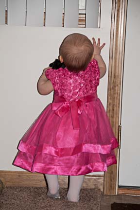
Below is a snapshot of my great-niece dressed up in a fancy fuchsia pink dress for her one year birthday. She has discarded her black patent-leather shoes and seized the TV remote control and is at the door. Maybe you don’t know that one-year-olds love doors. They will open and close a cupboard door with as much delight on the first swing as the fourteenth! She has her eye now on opening all the doors in a house and someone has just walked out of this door, drawing her attention to it.

One year old investigating the recently closed door.

One year old investigating the recently closed door.

I like what this picture says even without seeing the toddler’s face (trust me, it’s very cute!), but it’s not one with which you would do anything. The image is pretty cluttered, the shadow distracting and you can’t really tell what’s in her hand is a stolen remote. This photo doesn’t have the sparkle of a special day except in the beautiful color and texture of the dress.

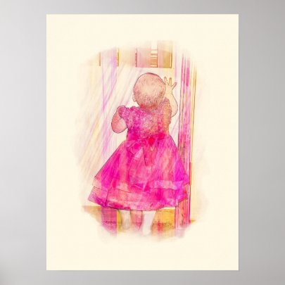
A few trips through Adobe Photoshop, Lightroom and Filter Forge allowed me to create a transformed image that speaks of the magic of a little girl’s first birthday wearing a gorgeous party dress and exploring her world.

This is why I love digital art tools. πŸ™‚


Lucky for me, Zazzle has a big sale on posters right now, so I just ordered an 18×24 print on heavyweight matte paper. It’s already queued for shipping, too!

Overcome the Mistakes Greeting Card Writers Make

Are you a greeting card writer? If you offer any cards on Zazzle.com, you probably are! Greeting card writers do include many Zazzlers and designers for other print-on-demand companies.

Step up to the plate, Zazzlers! Become greeting card writers

Evening calm greeting card

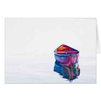
This red canoe card is blank. While the design has sold on other products, it has never sold as a blank greeting card.

Zazzlers – DON’T say you only sell blank cards. Frankly, that’s a cop-out for most designers.

If you can’t think of anything to say, how can your customer? If you want to leave them to do the hard part, what do they need you for? And, on Zazzle, how would they ever find you?

People buy cards because of what they say AND show.

You can write better greetings – and will probably make more money in the process! People love for you to come up with something they wish they would have thought of themselves!

7 Mistakes Greeting Card Writers Make – free ebook

So, if you’re not a designer who is also a greeting card writer, you probably should be! Learn the 7 Mistakes Greeting Card Writers Make – a free ebook on Amazon.com. I was looking for something else and stumbled across this 33 page ebook by greeting card designer and writer Kate Harper. It’s a quick read with some good pointers that you can absorb quickly. (I don’t know how long it will be offered free; the regular price is only 99Β’ anyway. :))

7 Mistakes Greeting Card Writers Make directly addresses those who submit verse to greeting card companies, but there are basic tenets that apply to all greeting card writers.

Do you think it’s hard to write suitable text for greeting cards? It can be! Even artistic types who create their own cards online at Zazzle or at home with rubber stamps and textured paper can feel blank when it comes to adding verse to their card.

Verse doesn’t have to mean a poem. Shakespeare is not who you should be channeling (that’s in line with one of the mistakes that greeting card writers make!) And do you really see that many rhyming verses in cards? Beyond the old “roses are red, violets are blue” style just for fun, that is.

Good verse hits with a zing and makes me believe someone knows exactly how I feel. Customers want a sentiment that is direct, short and honest.

Mistakes Kate Harper includes are Forgetting That A Card Is A Relationship, Too Many Adjectives, Too Much Syrup. While not all of it applies to Zazzlers, many designers on Zazzle.com are also interested in other venues where it would apply.

Don’t make these boo-boos either, greeting card writers!

Ms. Harper didn’t include spelling and grammar cautions, but Zazzlers need to watch out for these errors as well. Sentiments like these are seen too often on Zazzle!

Your the best! FAIL. You’re the best. RIGHT.
You could of been a ghost. FAIL. You could have been a ghost. RIGHT.
Conradultions! Your on your way! FAIL. Congratulations! You’re on your way! RIGHT.
Cats’ are in charge. Its just that way. FAIL. Cats are in charge. It’s just that way. RIGHT

Ouch. The fails are ugly, aren’t they?

Missing You Quiet Evening Red Canoe in Still Water

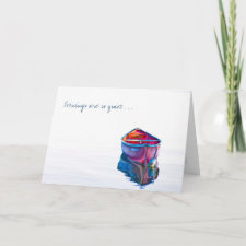
Greeting has been added to turn this red canoe card into a sentimental missing you card. Who would buy this version?

Learn how to write greeting card verse yourself

Go hang out in the card section of Target for an hour. Go visit your local Hallmark store. What cards are you drawn to? If you don’t have a particular occasion in mind or aren’t newly, madly in love, you probably end up in the humor section, right? Look at how the writers draw your attention. How do they make you laugh? Are there cards that touch you?

Try to figure out why and how you can do something similar. We’re not talking about copying; we’re talking about seeing what works. The cards in the stores got past a bunch of hurdles that Zazzle cards don’t have to jump over. There’s more to learn from those who are doing it right, isn’t there?

People love to laugh and greeting cards are one way to share humor. Add fun greetings to your cards! Write sentimental verse that you wish someone had written for your wedding or new baby or the loss of your old dog. Make several versions and try them out on your friends, or ask for opinions on your blog or Facebook page. Do you see how much easier it is to market greeting cards with verses? They go with occasions or offer humor or sentiment, so they are much easier to categorize and promote!

Surprise your audience!

It’s not necessary, but would really help if you did something like narrate a National Geographic video about an obsure, fearless, impossible-to-poison-or-destroy little animalΒ  and made it so funny that others start to care that Honey Badger Don’t Care!

You have heard of the viral Honey Badger video, right? [warning – narrator Randall is a potty-mouth] It turned the honey badger and Randall into famous icons for 2012!

What makes you laugh? What makes you cry? Probably the same things that touch others. Find the fun, the difference, the humor and the touch-your-heart thoughts and turn them into good verse. Can’t you see yourself becoming a badass greeting card writer! (OK, too much time looking at honey badger stuff gives a person attitude!)

That good verse can turn into better dollars. πŸ™‚ You can do it.

Make me laugh.

Make me cry.

Make me pick up the phone and call my sister.

Make me not feel alone when I bury my dog.

And take that to the bank!

Christmas holiday cards are the biggest sellers for greeting cards and Christmas sales are just getting underway, so it’s not a bad time for Zazzle designers to check on their cards and add a few more with appealing text!

Or get a jump on the one of the other most popular greeting card occasions – Valentine’s Day!

Fun words work on magnets, too, everyone. And calendars. And mousepads. πŸ™‚

Wishing you all a lovely Friday and a prosperous holiday season.

Earn more money on Zazzle!

Do you want to earn more money on Zazzle? If you’re selling right now, be sure to optimize your profits on each and every product! This 5 minute video shows you how.

Profit on Zazzle products is influenced by several main factors:

  1. Royalty
  2. Sales and coupons
  3. Referrals

This video shows you how to look at the royalty you set in combination with the price and profit. It appears today that the advanced royalty calculator on Zazzle is working properly again!

Don’t forget that royalty changes only go into effect once a month now. (Thank you, Google!) The cut-off is the 20th, but you really want to get your changes in by the 19th, just to be sure. It takes a few days after the 20th for the changes to show up.