topNav

Author Archive | Debra Schmidt

Aside

Content Thieves Got You Concerned?

I gave a talk yesterday at the Metro Detroit WordPress Meetup and a question came up about protecting content on WordPress sites.

How do you prevent people from stealing stuff from your WordPress site?

Another organizer found this great article from WPMU.org by James Dunn called Stop WordPress Content Thieves from Stealing Your Content – and Your Band Width.

He’s got some fantastic suggestions for things you can do over and above watermarking your images. There are plugins available to help protect your content, images, video AND good standing with Google. You may want to take action or at least bookmark that article!

WATCH: Handy Tool for Copyright Permissions

Someone said it so well. . .

Have you ever wanted to quote someone – maybe on posters you’re creating on Zazzle.com – and wondered how to get copyright permissions? Or if, indeed, you needed permission at all? One resource is the US government: US Copyright Office. That lets you search by works created since 1978. Then what?

But how about simply conducting a copyright permissions search by typing in an artist’s or writer’s name? Try WATCH!

What is WATCH?

The University of Reading (Reading, England) and the Harry Ransom Center (Austin, TX) together offer a searchable database of copyright contacts for writers, artists and prominent figures in other creative fields. These are the companies who can authorize (license) copyright permissions.

Read the information about the database on their About page. Note the head’s up for totally relying on WATCH as the be-all, end-all of copyright / permission information, but this is a great start.

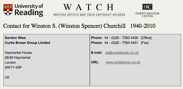
To try it out, I enter Winston Churchill’s name. He was a very quotable person in the 20th century!

Search box for Churchill

Search box for Churchill

The results in the second box indicate with whom I should check before quoting Churchill, especially for commercial use such as for Zazzle designs. (BTW, I have zero idea if they do grant permission or not; I did not contact them.)

Winston Churchill results

Winston Churchill results

If a search turned up a licensing company, I assume I have to seek permission to use work from that artist or writer. If it turned up blank, I’d think I might be ok, but I learned better with the Oscar Wilde example!

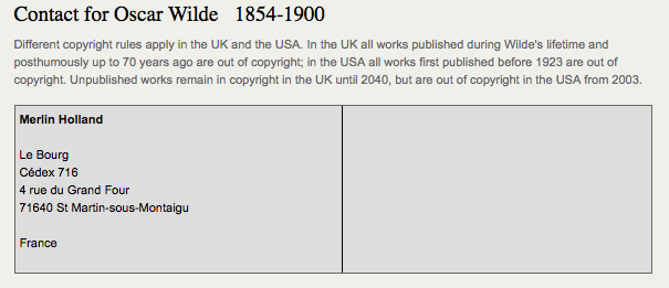
The results for Oscar Wilde are more ambiguous on WATCH because they have notes about differing UK and USA rules AND an address in France! I don’t understand this one at all, I have to say.
Oscar Wilde search results

I used to believe that if a work pre-dated 1923, it was ok to use. Well, maybe. Maybe not. So, I try to check it I’m going to quote someone. I also double-check the source of a quote – you would not believe how many quotes are falsely attributed to Kurt Vonnegut, for instance!)

I, myself, had some Oscar Wilde quotes removed from Zazzle which was a puzzle. Wilde lived from 1854-1900, so his work would ordinarily have gone into public domain by its age. This was one of the tricky ones! I don’t pretend to understand it, but I believe it has more to do with trademark than copyright. This particular writer’s info is perhaps not fully addressed by the WATCH site. (They caution you for good reasons!)

Since I had products taken down, I did a separate Google search on “Oscar Wilde copyright” and was taken to a website of a licensing company, CMG. The Official Web Site of Oscar Wilde has more info (FAQ) and links back to CMG.

 Permission and Zazzle.com

There are differences in using quotes in editorially, commercially and personally, so be sure to check! If you stand to make money utilizing someone else’s words, art, or other creative work, you may very well have to gain permission and possible a licensing agreement. What that entails, you have to find out on an individual basis. If you do pursue it, know that

  • You may or may not get permission.
  • You may or may not be able to afford the conditions under which you could get permission.
  • The cost of not finding out may be even higher, however!

For those of us creating on Zazzle.com: if you have permission to use someone else’s work, you may want to post a notice on your site AND contact Zazzle to show proof of that permission. Zazzle has been known to remove alledgedly offending products without warning and, often, without much recourse for the artist. An ounce of prevention saves a ton of problems later!

On the Zazzle help page,the acceptable content guidelines note:  No text or images that infringe on any intellectual property rights including, but not limited to copyrights, trademarks and rights of privacy/publicity. More info about the Zazzle copyright policy may be found on this help page.

There are always people looking out for other artists who will report designs they think infringe on someone else’s rights. (That’s not the ideal protocol, but it happens.) Additionally, licensing companies may do automated searches of the web to look for possible violators. Zazzle undoubtedly has a list of artists, writers, celebrities, companies, etc whose intellectual property may not be added without permission.

If you have ever had something taken down, you know how troubling that may be. This is one way to help yourself stay out of trouble!

As artists and creators ourselves, we should understand this subject from both sides. 🙂

Note: I am not a lawyer, nor offering legal advice. The information here may be outdated by the time you read this! And IP law is evolving all the time. WATCH is one tool available on line to help you research intellectual property concerns. It’s important to understand that there are different kinds of rights out there and intellectual property law is a complicated subject. Another online tool you should become familiar with besides the Copyright Office noted above is the US Trademark Office search.

5 Zazzle Store Customizations You Must Do!

tips for Zazzle store customization

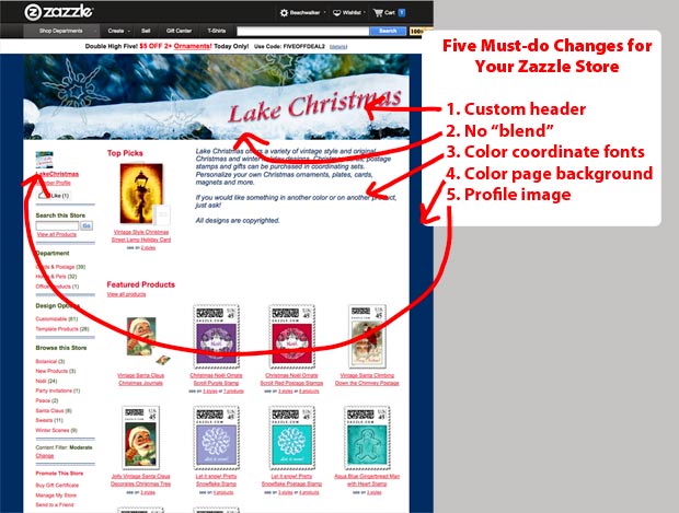
5 must-do tips for Zazzle store customization

No coding required to polish your Zazzle custom store!

You don’t need to know any HTML or CSS to make five of the most important customizations for your Zazzle store.

Many successful sellers have done nothing beyond these changes to customize their stores, so don’t think a really fancy design is crucial to good sales. Just start with these five basic changes. These customizations will help make your site look more professional, showcase your designs AND lead to better sales opportunities!

Zazzle Custom Store Components

To create a Zazzle custom store, these are your essentials:

  • 900px x 200px header with store name or other info uploaded to Zazzle
  • 200px x 200px square profile image uploaded to Zazzle
  • hexadecimal color numbers that coordinate with your header image (see post on Colorzilla for help with this)

If you have these ready to go, it will take about five minutes to customize your store appearance! Go to your Manage My Store link and then Appearance to start your store transformation! [note: There’s a 5 minute video at the bottom of this page on Zazzle Custom Store Tips if you’d rather watch how to do this.]

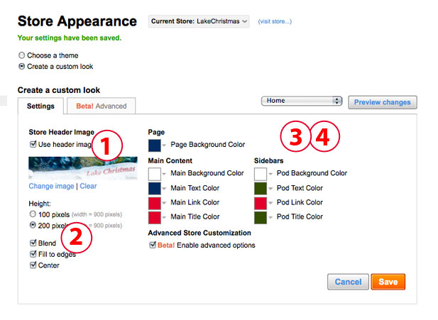
how to make changes 1-4 to your Zazzle store

1. Custom Header

Add a custom header, preferably with your store name and an indication of what’s in your store. You can feature one of your designs or products showcasing your designs. Or you can carry over your branding and colors from another site. No naked people, please, but your other designs should be fine. You can create this in Photoshop, Gimp, Illustrator, etc. Most people choose the 900 x 200px size jpg image. If you have uploaded your header to your Image folder, it’s easy to drop it in here.

You can change your header as many times as you like. Save and click on the blue visit store link to see if it turned out as you planned.

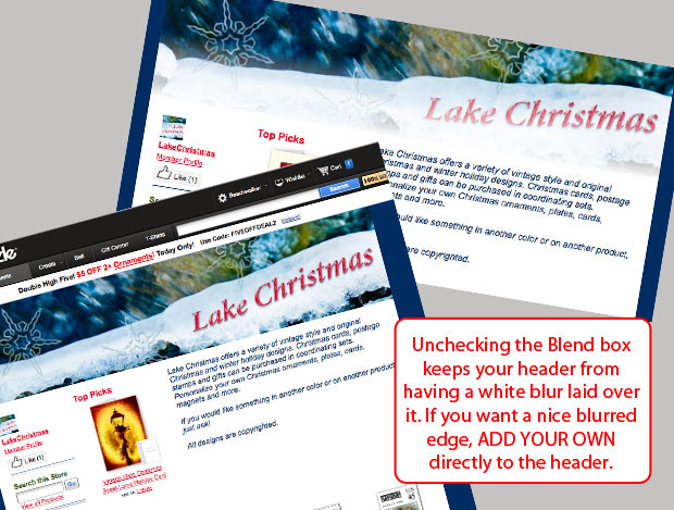
2. Check the Edge Blend

By default, Zazzle adds a white blend edge to the bottom of your header. If it works with your design, awesome! Chances are – it won’t! The soft edge can look very good, but the effect is better if you create it yourself on your header image before you upload it. You can then choose the color and amount of blend. You can also put your text over the blend. I saw another store yesterday where their attractive header design was ruined by not managing this edge! You can leave a hard edge or put any kind of border on the bottom in Photoshop if you prefer.

All you do is UNCHECK the box marked Blend! Please, do this. Your store usually looks lame if you leave it on.


tips-for-store-customization4

See the difference removing the blend option makes!

3.  Coordinate your storefront colors

You can control the text, link and title colors for your storefront and the sidebar (pod) as well as the store and pod background colors. The default colors when you’re in custom mode are fine, but your store will have a more harmonious or dynamic appearance if you coordinate the colors. Keep in mind that people are trained to think of links as blue, so if you have a shade of blue / turquoise / aqua, use that one for the links. A text font in medium gray to black, dark brown or another easily read color is good. You can choose to use your accent color on the titles.

Just be sure that there is good contrast between your link color and your main text. AND that all of your text is easily read against the background colors.

I usually leave the store background white. Why? Because I used to change it to very elegant shades of ecru and toast and aqua. Then Zazzle made changes to the backend and the backgrounds of all my products suddenly went white! Arrrgh! It eventually did get changed, but my store pages had an very unattractive patchwork quilt appearance! I had better things to do than fix that!

So, the simplest choice for your store background is white.

4. Choose a page background

Your page background is different than your store background. The store background is under your images, the page background is outside your storefront. Much of it is not actually visible, depending on the screen size a viewer has. The default color is actually fine, but why settle for fine when you can have coordinated?

Pick out a color which may or may not come from your header image and use that for your background. You can, of course, add a background image or pattern, but that will require you to break into the code. 🙂 A nice color is easy to add. Your options include:

  • blend the page background with the store background color
  • focus attention on your store with a black or other very dark color background
  • drench your store with color

Don’t be afraid to experiment with all the text and background colors. Just be careful!. Red or royal blue on black is hard to read. Light purple is so abused, be careful with it.

5. Add a profile image

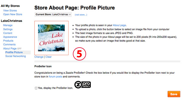
Adding a profile image is the final bit of polish for your initial store customization! In Manage my store, go to the About Page section. Click on Profile Picture and upload your photo. It’s going to drop into a square space and you won’t be able to crop it, so the recommended 200x200px size is perfect.

tips-for-store-customization3

Your profile image, or avatar, can be a

  • photograph of you, your kid or your pet. Head and shoulders, or just a head shot is good. No one says it has to be current.
  • illustration of you, your kid or your pet.
  • logo or other design that fits with the store.

Please, don’t use Mickey Mouse or Felix the Cat. They aren’t yours to use. This is YOUR store, have the profile image indicate something about YOU and/or YOUR STORE.

Ok, done yelling! It’s nuts to see avatars that don’t belong to people on their stores and doesn’t show anything about their work except they know how to copy!

Want more help?

If you would like a store designed for you, contact me and I’ll be happy to create a custom design using your own images or products. If you want to discuss your Zazzle store – its design, content, marketing – you can always ask on the forums. Or you can contact me for some individual coaching over Skype or via messaging.

Watch a quick video on creating your Zazzle custom store here:

Zazzle® Instant iPhone App – New!

You’ve been wondering how to instantly turn your iPhone photos into cool products, right?

Oh, you neither?

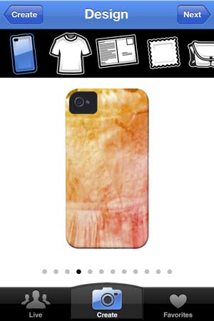
Well, sometimes we just don’t think of all the possibilities. Some right-brained person came up with the cool idea and found some coders to turn it into an interesting app. The official Zazzle Instant page has more details. Basically, you load the app on your phone, and take a photo (or use one you already have) and play with it to create nearly instant custom products.

It’s a free app. Check it out in the iTunes store. If you use this app along with free shipping available from the Zazzle Black program (if you’re in the USA), you could enjoy quickly sending cool gifts to yourself, friends and family.

How Zazzle Instant Works

I did some test images with photos on my iPhone.

The process is

  1. Create:
    1. Choose / Take a Photo
    2. Move and Scale
  2. Design
    1. Choose product
    2. Apply filters
  3. Review
    1. Share
    2. Add to cart for purchase
  4. Go to Zazzle site and buy

It’s easy to jump back and forth between all the options.

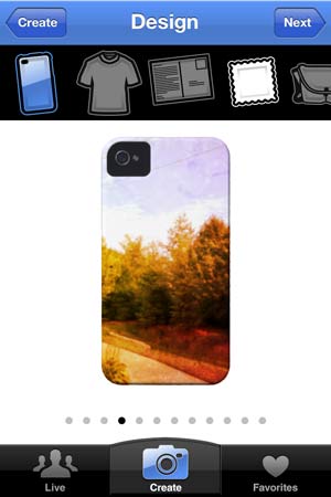
There are currently ten filters you can apply for many of the products, but they are “either or.” In other words, no overlapping of filters. You change them by swiping across the phone.

Which products are available?

The choice of products is limited, but seems practical:

  • iPhone 5 case
  • t-shirt (different variety of filters!)
  • postcard
  • postage stamps (that’s a surprise because US postage has strict rules!)
  • messenger bags (a variety of collage options makes this one possible)
  • playing cards
  • stickers
  • photo plaques
  • pillows (was grayed out for my photos because it requires larger images – this won’t work for everything!)
  • wrapped canvas (was grayed out because it requires larger images also)
  • iPad sleeves
  • greeting cards
  • square magnets
  • buttons
  • mousepads

photo resolution warningA yellow warning sign indicates that a photo isn’t big enough to go on a product, so you won’t get blurry or pixelated images. If that shows up, you have to backtrack to Create again or choose another product.

Samples of how it works

Most products are straightforward. However, the t-shirts and messenger bags work differently than the other products because they offer a collage option that either breaks your photo into pieces and re-colors them or else adds it to an existing design.

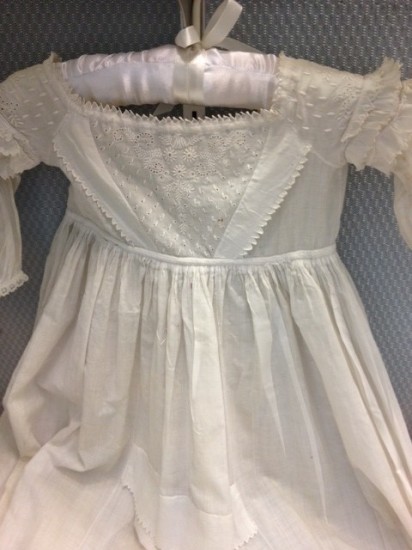
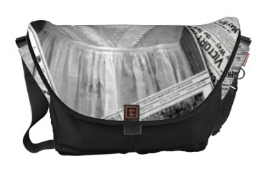
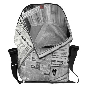
For the bags, you try out the various filters, but can’t see much until you click next. There you can (finally) increase the size of your product view. In the case of a two-sided design like the messenger bag, we seem to be SOL about seeing the back side. I don’t know about you, but I wouldn’t be too anxious to pay $85.95 for something I could only see on one side! The easiest way to see the back turns out to be to mail the product to yourself and then open it on Zazzle. Below is the original image of a baby dress on display at the library and how it turned out with the newspaper collage filter on Zazzle Instant.

christening dress photo original

baby dress photo original – as is from the camera

newspaper filter option on messenger bagdress on messenger bag full back

Another advantage to mailing it to yourself and then opening it up in Zazzle is you will get the option to change the binding and front colors and adjust anything you like. OK, that takes away from the instant fun, but still, that’s a lot of money for the messenger bags!

Postcards and mousepads are a different story! These, you could just order without having to look closer or see the back.

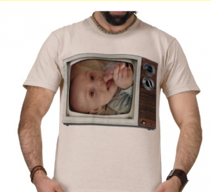
The t-shirts had some interesting filters that frame your photo or turn it into a collage. For a people photo, one of the framing filters is probably the way to go. Like this TV frame shows off the baby chewing on her foot.

Zazzle instant photo of baby on TV filter

Zazzle instant photo of baby on TV filter

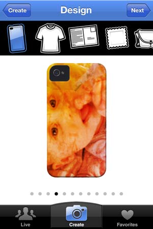
I found the other filters were less useful for people shots than objects or scenes. Like this 1974 filter: great on scenery, dismal on faces, interesting on objects:

scene with 1974 filterbaby with 1974 filterbaby dress with 1974 filter

How are Zazzle associates affected?

This app doesn’t offer benefits to Zazzle storekeepers or affiliates. It’s outside the regular Zazzle game, so there doesn’t seem to be a way for designers or affiliates to participate. Someone may figure one out, however! For now, you do sign in with your regular Zazzle account and password, but a created product won’t show your store name, just a numerical code for the designer. It’s just a cool option for consumers on the go in line with other instant products being offered and as part of the current liking for altered photos.

Bottom Line

The app got stuck for me after sending one of the emails and I had to power off the iPhone to re-set it. Other than that, it was pretty simple to use and there weren’t any dead ends. I would definitely consider using this to create cards and magnets and other gifts. I love the TV baby, but probably wouldn’t go for the messenger bags.

We’ll see if this app gets updated and where it goes. For now, just another cute toy in the iPhone users toybox!

Infographics

You’ve seen infographics all over the web lately, haven’t you? An infographic is simply a visual representation of some data / information presented serially or in a grouping. The combination of info and design creates increased engagement from readers as they study the different components of the infographic. People are more inclined to share infographics as well.

Charts, graphs, photographs, illustrations, 3D effects, typography and lots of color are some of the visual components.

The data can be anything. Just like displaying a rock on the windowsill sets it off as much as placing a vaseful of flowers there, data gains visual interest just from being on display. That doesn’t make it any more useful, important OR true. Just more digestible.

But really, I’m a fan! Just a skeptical one. (Too many years of corporate charting to be otherwise, myself!)

Some infographics are amazingly clever or beautiful. The first time I ever saw one was in 2006 or 2007 when I ran across personal annual reports created by Nicholas Felton. The reports comprised reams of mostly trivial data that gained meaning by its collection, compilation and display. When someone categorizes the animals they’ve eaten over the previous twelve months by Legs, Wings, Fins, Shells and No Shells, it becomes way more interesting! When they are an extremely creative and talented designer, it takes on a special character and beauty.

Today, I’ve been experimenting with a free infographic service, Visual.ly. You sign up for a membership, agree to not sell the infographics you create with them (and a few other terms), and then start experimenting!

Life of a Hashtag: #Zazzle

I love the retro colors and typography of “Life of a Hashtag” so I began there. This infographic tool searches Twitter data for the hashtag you specifiy and sorts out some pre-specified data for you based on tweets over the past month. Here’s how “#Zazzle” turned out:


create infographics with visual.ly

Not too sure I learned anything from this particular infographic, but I could see myself plugging in all sorts of hashtags and seeing where the surprises show up! If I wanted to rate my tweets higher on something like this, I’d have to actually use hashtags regularly!

BTW, I did go back to the Zazzle forums to see if I could determine what caused the little blip on September 4th. Probably the introduction of the wall decals!

Next step: to learn how to design infographics myself!  Socialable had a nice post today with 16 tools to make awesome infographics, so I’ll be checking out a few more soon and you can, too!

How about you – are you a fan of infographics?

My first “Brain” design!

You can laugh – most people would hardly call this a brain design! But it really is the first one I can recall creating that mentions the brain.

What was I thinking?

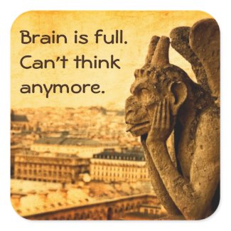
OK, this began as a photograph I took in Paris some years ago. It’s the Le Stryge (the vampire) gargoyle on the Notre Dame Cathedral. I didn’t know that at the time, but Wikipedia very kindly filled in the gaps in my knowledge. This medieval figure has been watching over the ever-changing Paris landscape for hundreds of years. You can’t tell from this angle, but the gargoyles served a functional purpose. The medieval builders were sort of like the Shakers that way, right? Ok, maybe not, but function and form were both extremely important to them. And back then, they had to create flying buttresses (extra angled walls) sticking out from structures to keep the walls from falling down and the roofs from collapsing in.

Plus, Gothic architects and builders were just starting to figure out how to incorporate windows without creating a structural fall-down hazards. They did a darn good job, didn’t they? Notre Dame is still standing. You may have heard about the stained glass windows in Notre Dame? There are these fancy rose windows that really show off what they could do.

Back to the gargoyles.

If a 21st century American were needing the function of the gargoyles, he would probably add utilitarian gutters and aluminum downspouts. Yep, the gargoyles were a rain control feature! Most of them could be seen with rain water spurting out of their mouths during a downpour. That kept the rain water a little away from the building and foundation and probably scared the bejeezus out of the illiterate population at the same time. I don’t know if the gargoyles were originally painted. Many medieval structures were once gloriously colorful. We think of them as classic stone and the painters would probably be crying at all that gray rock and wondering what happened to their brilliant red, yellow, blue and real gold designs!

So, this photograph got morphed through some delicious OnOne software and became the design you see now.

It struck me as I was looking at it that this vampire gargoyle actually looks tired, holding his head in his hands and sticking his tongue. After hundreds of years, he was really tired of sitting there with his wings still, looking at the streets and buildings of Paris.

I suddenly could relate! My brain was full of things to do, I was staring at a hundred projects that haven’t moved. So, Brain is tired. Can’t think anymore. was added to the sticker version of this design.

This is really how things get created, you know. So much depends on what is going on in the designer’s life at the moment!

How does the Le Stryge gargoyle’s expression strike YOU? What kinds of products does he belong on – if any?

Zazzle Product Review: Custom Notebooks

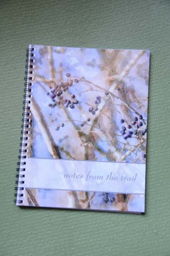
Wild Grapes in Winter notebookWhat did I think when I opened the package with my new Zazzle notebook?

Wow, the cover is beautiful! And super glossy! It is very true to the product image.

I had ordered the Wild Grapes in Winter Art Notebook from my Paper Lake store on Zazzle.com.  Sometimes a blue color leaning towards purple tips over to purple and looks weird, but this was just right. The Wild Grapes image is a watercolor style design created from a photograph of a sparse cluster of wild grapes against a blue-sky winter day.  I had not seen it printed on glossy paper before and I do like the printing! The translucency of the personalized text bar also came out very well.

This is a custom notebook where you can add your own name or other text to the front cover. Zazzle has thousands of custom notebooks available with prices starting at $12.95 and going up into the thousands. (People set those prices to raise money for charities usually, in case you’re wondering what makes people crazy enough to spend over $1000 on a notebook!)

To my surprise, the back cover is also glossy, although plain white. I rather expected it to be a cardboard, but it’s the same heavy photo paper as the front cover. The size is similar to the composition notebooks that I used to like – not so wide as those were, but a convenient size and not that many pages. It’s a comfortable size to stash in a large purse or tote or in a nightstand drawer. It’s too flimsy to write on without placing it on a hard surface.
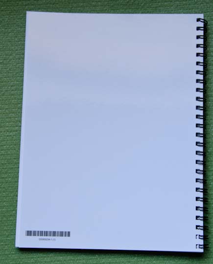
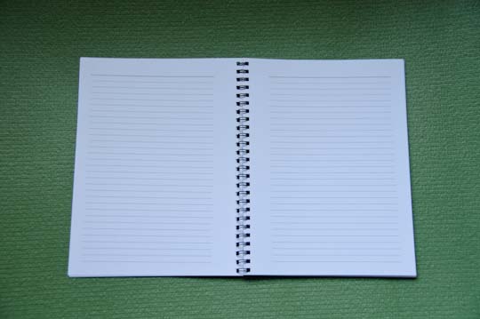
notebook back cover


inside pages


The pages have black lines made up of tiny dots with a darker line of dots at the top – a nice effect. Both sides are printed and there’s a comfortable margin of white around each page. These pages are not perforated, but then, I didn’t expect them to be. The inside pages have a decent weight and a nice hand (feel) to them. The spiral binding is a double black wire and the pages do open flat.

It would be nice if there were an option to choose a different kind of page – like plain paper for sketching or possibly graph paper, but the ruled pages do work for most people.

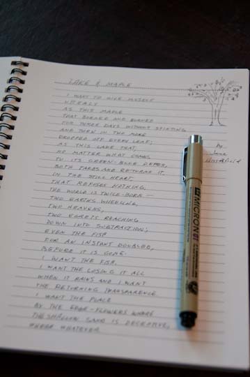
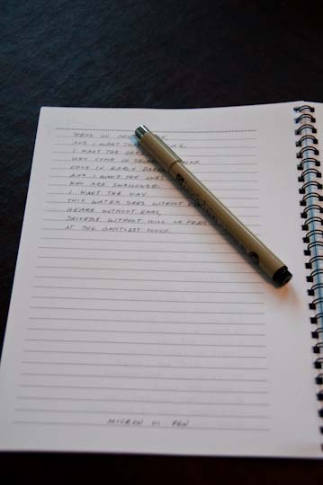
I wrote on the pages with two different kinds of pens to see how much bleed through there was to the back of the sheets. Not bad, although a very inky pen would have bleed-through. It was acceptable with both a fine art pen and a Uni-ball pen to write on both sides.
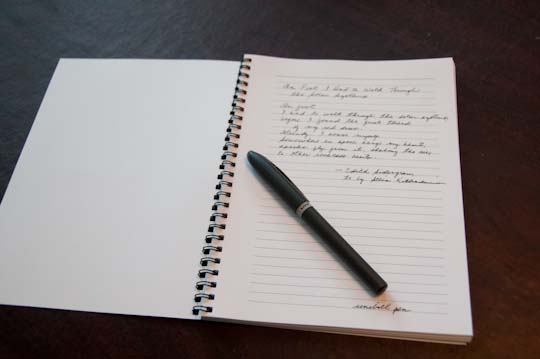
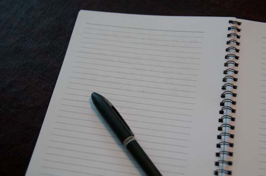
notebook pagenotebook page

Who would like custom notebooks?

You can get cute notebooks at discount stores for a lot less money, right? Why would you want to look at buying notebooks from an online store?

Simple. Choice and customization.

It’s hard to imagine how many different options there are when you order products from a print-on-demand or custom printing store like Zazzle or CafePress or the like. You simply cannot get this kind of choice any other way unless you pay a premium price.

Whether you buy a design already made up, personalize a template design or start from scratch with your own, you can get just what you want. Well, within your design capabilities, product limits and legal restrictions. 🙂

For a change, with this review, I gathered together some ideas of who might shop for custom notebooks – or who might like or use them. Here’s a not-very-long list. I’m sure you could come up with a lot more!

Travelers

Their light weight would make these notebooks nice gifts for travelers. You can customize many of them with their name or a phrase. You can choose one that has the flavor of their destination city. Or you can create your own! And create another one with a great cover photo when you return!
london westminster england art deco retro poster spiral note book  French bulldog in Paris spiral notebook Railroad Tracks in Autumn Custom Travel Journal African Theme Notebook

New Parents

A notebook that fits in a diaper bag as well it fits on the nightstand might be just the right gift for new mom or dad who want to write notes to their baby or about his or her smiles and accomplishments.
Our Baby Pastel Alphabet Blocks Custom Notebook Mommy's memory Notebook Blue Baby Carriage Shower Notebook Baby blue dot scallop circle custom photo journal notebook 

Creative Writers

This is obvious! Creative writers and custom notebooks go together like macaroni and cheese. Many times the act of putting pen to paper is a different use of the creative mind and writers like paper!
Purple Blue Kaleidoscope Pattern Custom Note Books Abstract Turquoise Ocean Blue & Seaweed Green Notebooks Simple grace purple green inspiration journal spiral notebooks  Peace Love Write Spiral Notebooks W

Photographers

Photographers can take notes in custom notebooks during a shoot, give custom notebooks to customers, take notes during a photography class and more. Show off photographs and collect knowledge!
Create Your Own Photo Design Notebook Stylish Initial Personalized Notebook My favorite things hot pink photo collage journal notebook Vintage Camera Photographers Notebook 

Cooks

If you like to collect or invent recipes on the go, you might like to carry a cookbook’s notebook with you. You can jot notes for a dinner party, request recipes from a fellow cook or keep track of special diet or cooking details.

Hunter Hunting Sport Funny Eat More Fast Food Buck Note Books Macaroni Loves Cheese, Cute Mac N Cheese Cartoon Spiral Note Books Italian Greyhound Dressed Up Like a Chef Spiral Notebook  Notebook Vintage Retro Lady Home Canning Recipes

Shoppers

Those of you who plan your Christmas shopping in detail and get started in the Spring might find it helpful to carry a little notebook for keeping track of sizes and wishes and gift purchases.
Peace Joy Love Hope Note Book  Thank you, Santa Claus! Merry Christmas Spiral Note Books Whimsical Christmas Planning and Shopping Notebook Gingerbread Man Spiral Note Books

Brides

Brides can use custom notebooks for planning the wedding, the honeymoon or just writing about their special day. Custom notebooks also make excellent wedding guest books.
Heart of Sea Shells on Beach Photography Notebook Something Blue Damask Wedding Planner Journal Spiral Note Book  Personalized Bridal Wedding Journal Damask Notebooks Custom Photo Wedding Guestbook - Sage and White Spiral Notebooks

Guest Books

If you have  a house you rent out, a cottage with lots of visitors or a shop with walk-in customers, chances are you could use a guest book to collect notes, address and memories.

Up North Lake Huron in Summer Journal Spiral Notebook  Vintage Vegas Wedding Guest Book Template Notebook Watermelon Picnic Guest Book Notebook Personalized Pink Rose Floral Guest Book Notebook 

Hobby Notes

Whether your hobby is a handcraft, bird watching, genealogy, rock collecting, gardening or navel gazing, you probably like to take notes occasionally. What works better than a custom notebook just for that?
Beach Stones - Red and Orange Granite Notebook Black Lake Wildflower Photography Collage Notebook Colorful blocks of knitted yarn spiral notebooks  Genealogy Preserving The Past Spiral Notebook


The Bottom Line

Am I happy with the notebook? Mostly. I just would have preferred a much sturdier back cover. Actually, I would have liked a back cover that wasn’t glossy either.

Rating: ♥♥♥

Features:

  • Cover printed in vibrant, sharp color
  • Lay flat spiral binding
  • 80 black & white pages on 60# paper
  • Size: 6.5″ x 8.75″

Price:

With prices starting at $12.95, these are a bit pricey to buy a whole bunch for all the kids you know in school. It’s not bad for a gift or a self-indulgence. Not to keep harping on the back cover, but a sturdy back cover would have affected my opinion of the price. If notebooks have gone on sale at Zazzle at all, it was a one-time shot. Notebooks do not carry a volume discount either. Of course, there’s no set-up charge!

Competing Products:

For comparison, I checked on Cafe Press’s notebooks. They are a little bit smaller than these at 5×8 and start at $11. I had ordered one of those some years ago and it also had a flimsy back cover, but made of black plastic. You do get four choices for the type of inside paper however. I also looked at Blurb.com, which lets you order custom notebooks. You could order a very different kind of custom notebook there (hardcover and you can choose the type and number of pages and also print images on some of the interior pages). Blurb books start at $16.95

One thing both Blurb and Cafe Press do that is seemingly more helpful is give the paper weight on two different scales: Blurb is 60# or 90 GSM. CafePress is 60# bookweight or 24# bond. Not being a printer, I have little idea how either of those relate to Zazzle’s 60# paper. They might all be the same because 24# bond ledger paper is equivalent to 60# offset text paper which is equivalent to 90 GMS (grams/square meter).

Shipping:

  • It arrived pretty quickly and was well packaged in a box.

If you’d like to shop for a custom notebook, start here.  If you’d like to try creating your own, go here.

Kindle Daily Deal on 5 Brain Books Today! Only $1.99 each!

Just heard about this – Amazon’s Kindle Daily Deal features five brain books today for only $1.99 each. They sound pretty darn geared to the RIGHT BRAIN.

Amazon says this “inspiring collection is filled with fascinating and fun strategies for unleashing your imagination, recharging your intuition, and bolstering your self-confidence. All five books feature expert advice and refreshingly original approaches designed to improve your mind and quality of life.”

Save up to 79% if you order any of these today.

5 Brain Books on $1.99 Kindle Daily Deal

Check them out:

Are you in a creative rut? Break out of it!

rutted pathEvery one with a creative bent finds themselves feeling blank sometimes. Your hands are poised above the keyboard as you stare at a empty white screen, you hold a pencil or paintbrush in your hand and glare at a fresh new canvas, you look at your sewing machine and a shelf full of fabric, you wander around the neighborhood with a camera in hand and nothing clicks or comes to mind.

If your creative life were a journey, you just stepped into a pothole. Instead of scrambling out of it, you have gotten yourself stuck into a rut, the kind where your shoes are hard to pull out of the tight fit. It’s like trail in the woods where so many dirt bikes have raced along it that their tires have cut a sharp groove into the path and you are now trying to walk in it. You are so focused on getting your feet loose from the rut and looking down at it that you can’t see anything else. No fresh ideas or new thoughts are coming to you. You don’t even see the scenery around you. You are STUCK in that creative rut.

Of course, you don’t have to stay stuck! Just stop for a second.

Take a breath.

Put your head up and get your bearings.

OK, now it’s time to start climbing out.

Here are some ideas on breaking out of a creative rut. If you can figure out what is currently keeping you in that rut, you can figure out how to get out!

My favorite is Think creatively first. Edit later. Thinking creatively and logically at the same time won’t get you the best results. In other words, use both sides of your brain but NOT AT THE SAME TIME.

How to Break Out of a Creative Rut
Like this infographic? Get more content marketing tips from Copyblogger.

Thanks to Brian Clark at Copyblogger for making this infographic available to share here on RightBrainLeftTurn.com.